Amsterdam based art direction, graphic design and visual art practice with a specific focus on book, exhibition design, and other collaborations within the cultural and music sector.
Running the independent publishing imprint Building Fictions.
- Selected Projects / Press
Ongoing art direction and design Smiling C (collab. Asger Behncke Jacobsen)
Ongoing art direction and design HEAT Amsterdam (collab. Nora Steenbergen)
Design Dutch Pavilion, Milan Triennale
Design, storyboarding for title wall and videos for the Pirouette exhibition, MoMA, NYC (motion by So-Yeon Kim)
Solo exhibition Instars and Imago at Ravisius Textor
Interview Tique Art
Design exhibition De Ploeg in Bergeijk
Sunny 16, Looney 11, installation at Kunsthal Ghent
Jan van Eyck Academie Open Studios - Past clients and collaborators
MoMA (New York, US), Het Nieuwe Instituut (Rotterdam, NL), Kunsthal (Ghent, BE), Ravisius Textor (Nevers, FR), V2_ (Rotterdam, NL), Jan van Eyck Academie (Maastricht, NL), Kunstverein (Amsterdam, NL), PAKT (Amsterdam), Heat (Amsterdam, NL), Smiling C (Santa Cruz, US), Stedelijk Museum (Amsterdam, NL), Latvian Contemporary Art Center (Riga, LV), Editions Biceps (FR), De Gids (Amsterdam, NL), MetropolisM (Amsterdam, NL), Tate magazine (London, UK), MacGuffin magazine (Amsterdam, NL).
- Awards
Best Dutch Books 2024: Forget Me Not – double selection
Best Dutch Books 2023: Notes on Devils – double selection
Walter Tiemann Preis 2024: 333 – honorary award
Best Dutch Books 2022: 333 – double selection
Most Beautiful Swiss Books 2020: Dear Clay,
Best Dutch Books 2020 (× 4): Dear Clay, No Thanks I’m Just Looking, Bottle Joe, I See That I See What You Don’t See
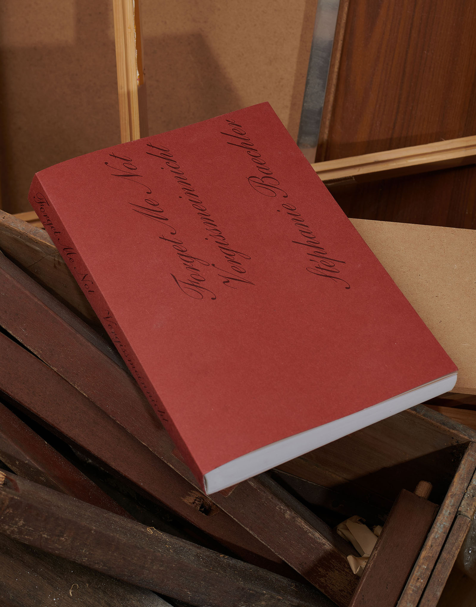
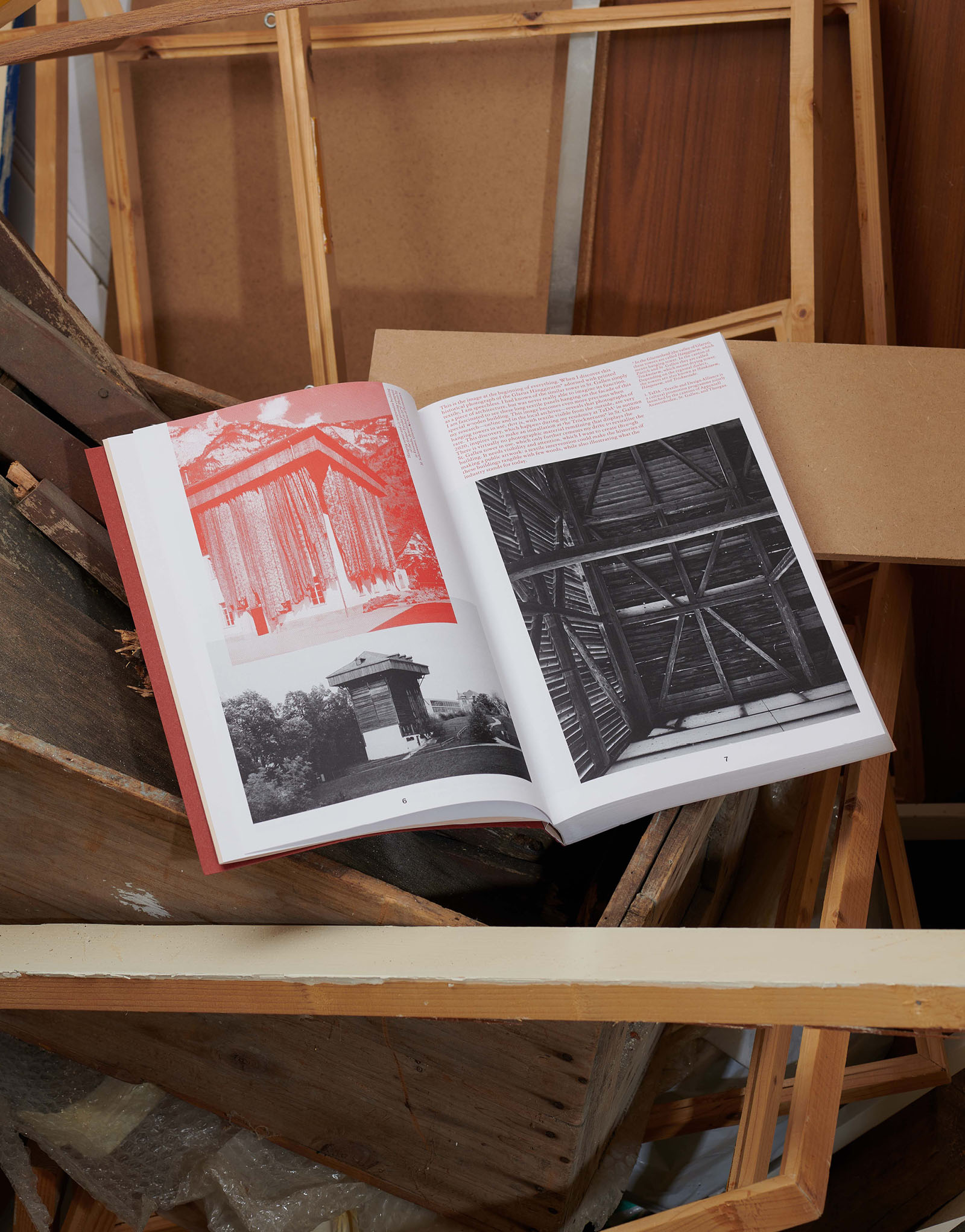
Forget Me Not, Stéphanie Baechler, photos by Ladina Bischof, published by Building Fictions
Publication design and publishing
404 pages, 220×340 mm
(Photos by Elmer Driessen)
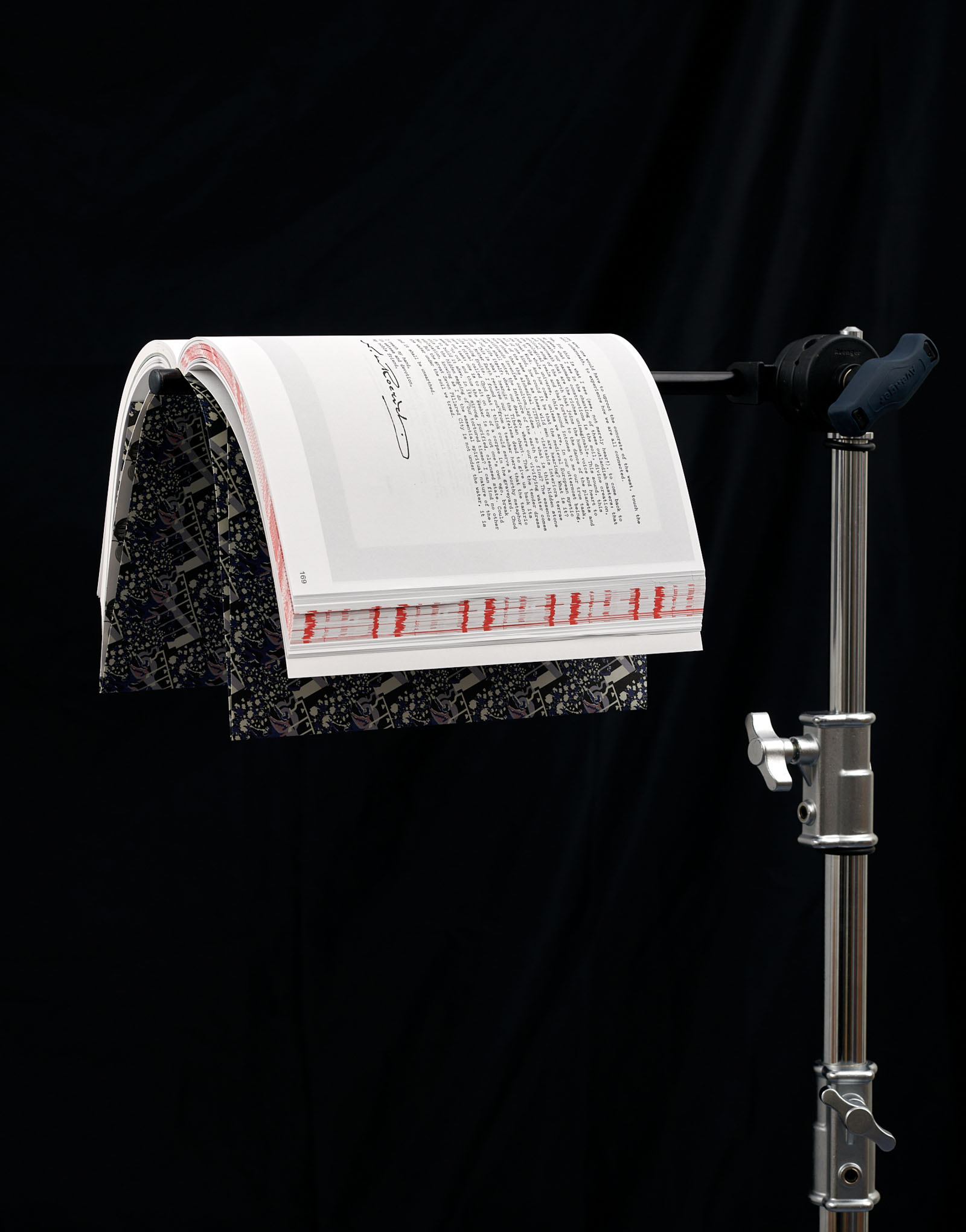
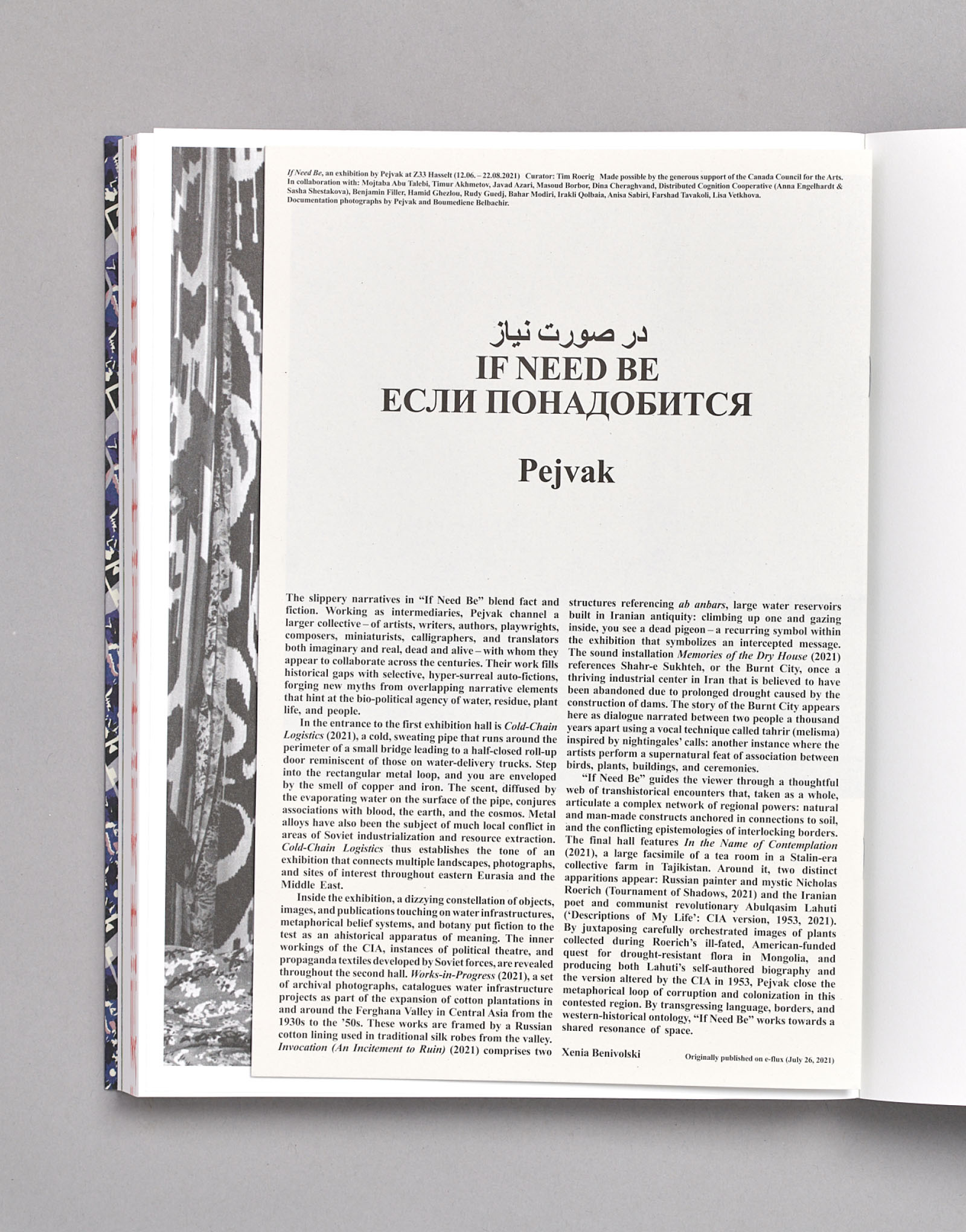
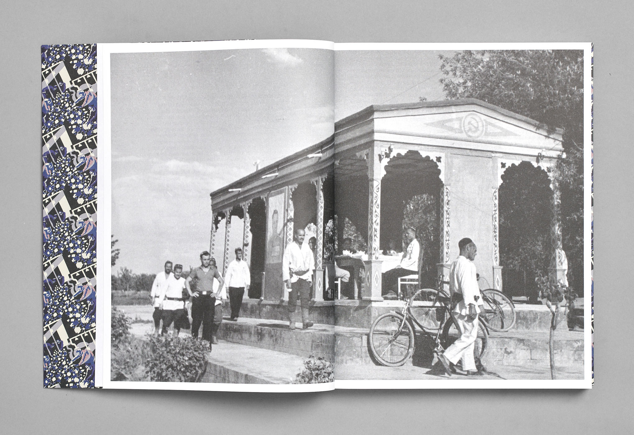
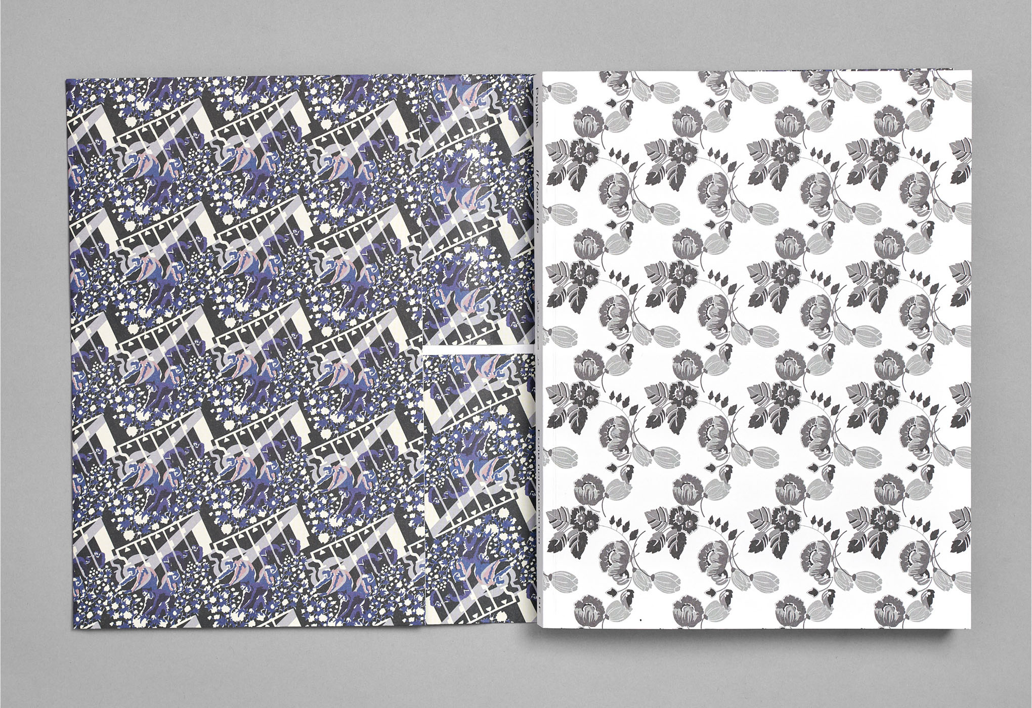
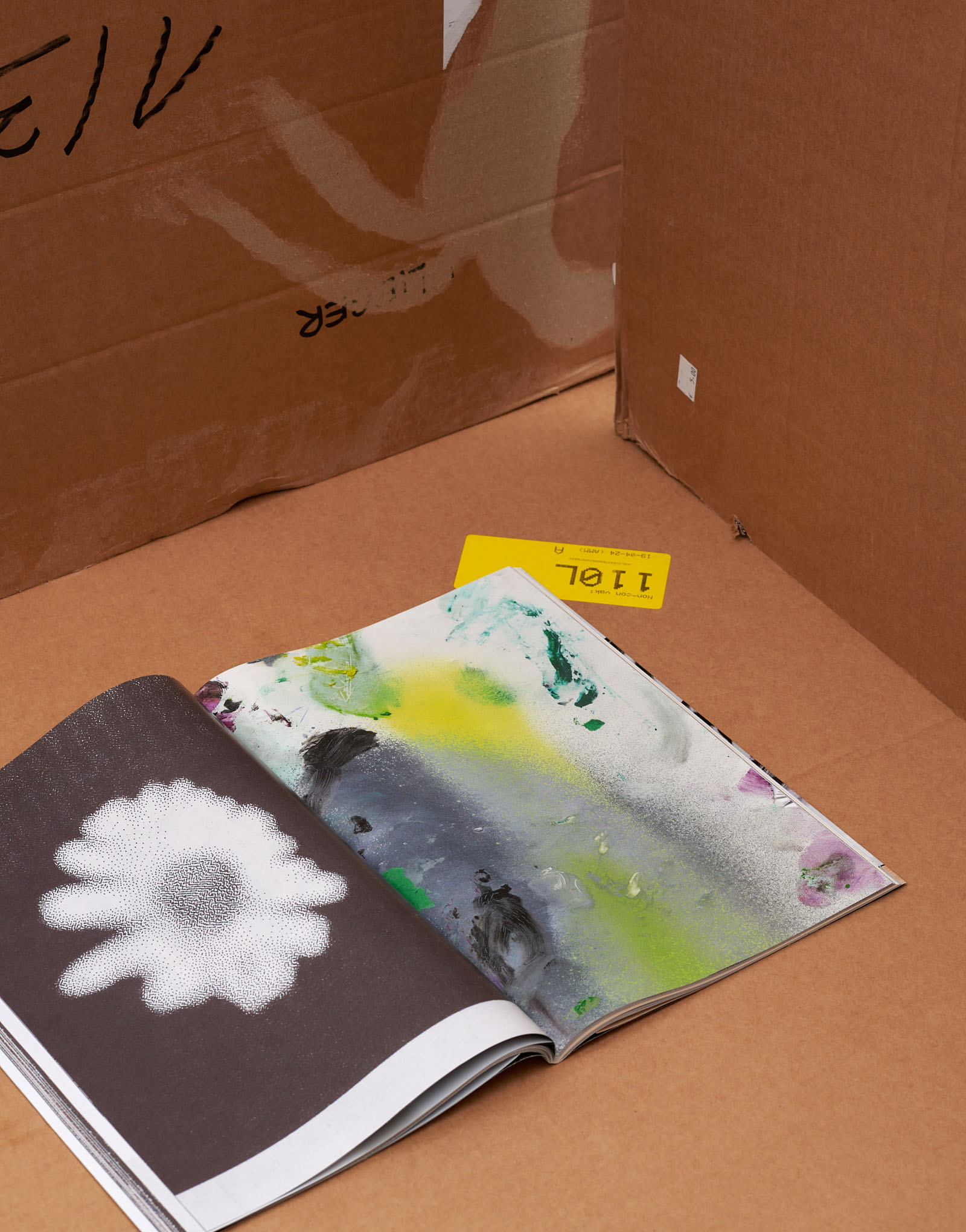
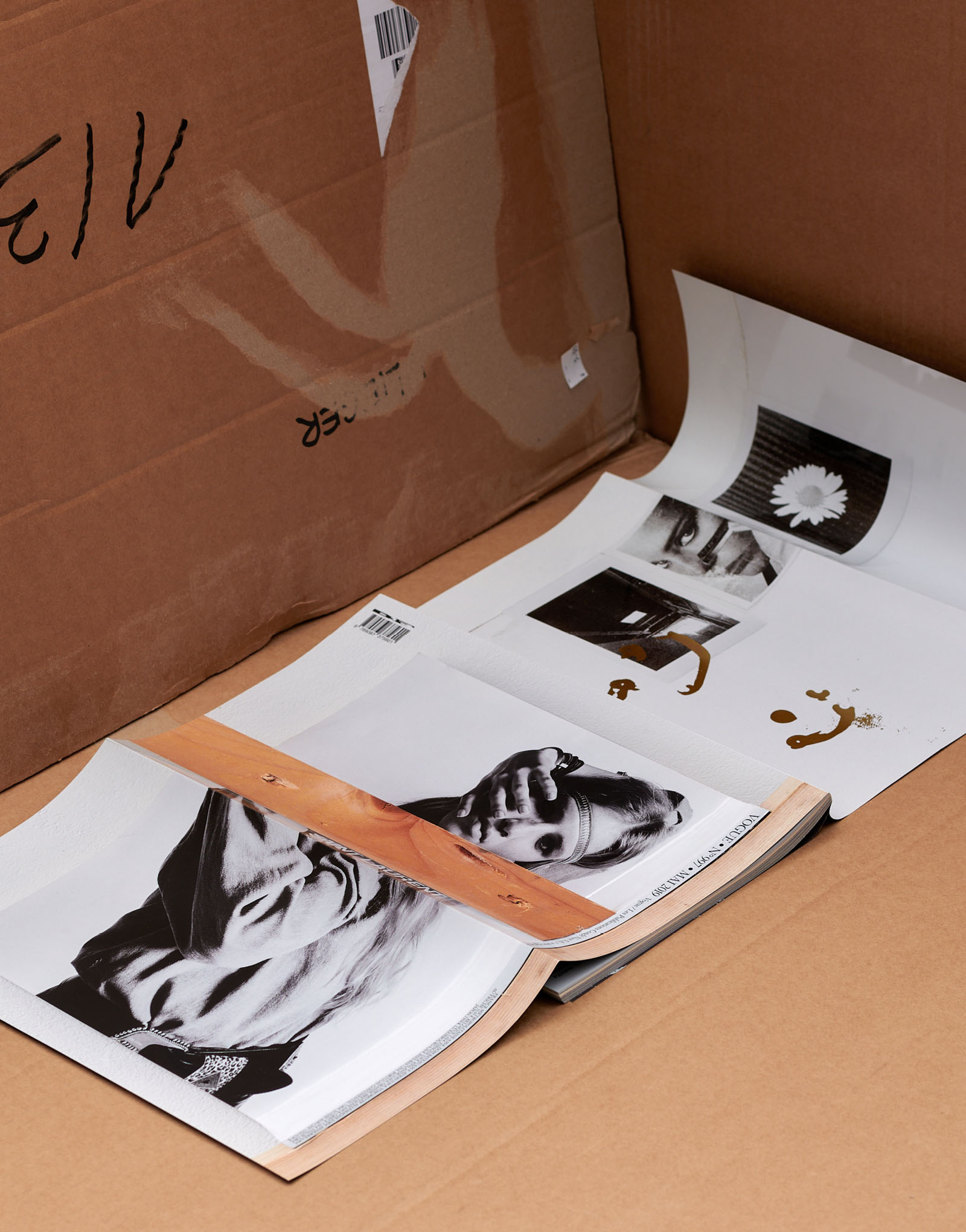
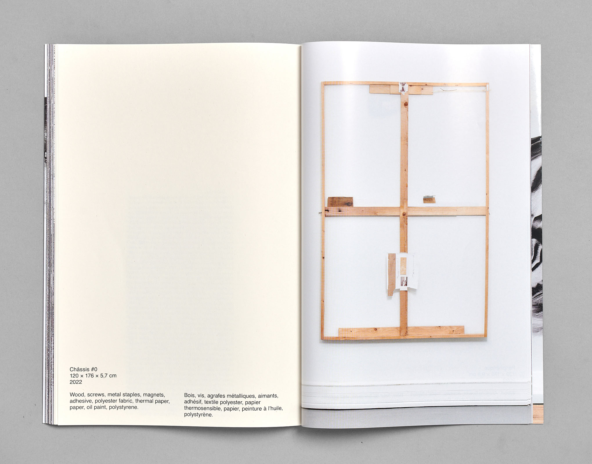
If Need Be, Pejvak, published by Building Fictions
Publication design and publishing, collab. Timur Akhmetov
316 pages, 230×300 mm
(Photos by Elmer Driessen)
Mercurial, Martin Huger, published by Building Fictions
Publication design and publishing, collab. Jérémy Glatre
160 pages, 215×320 mm
(Photos by Elmer Driessen)
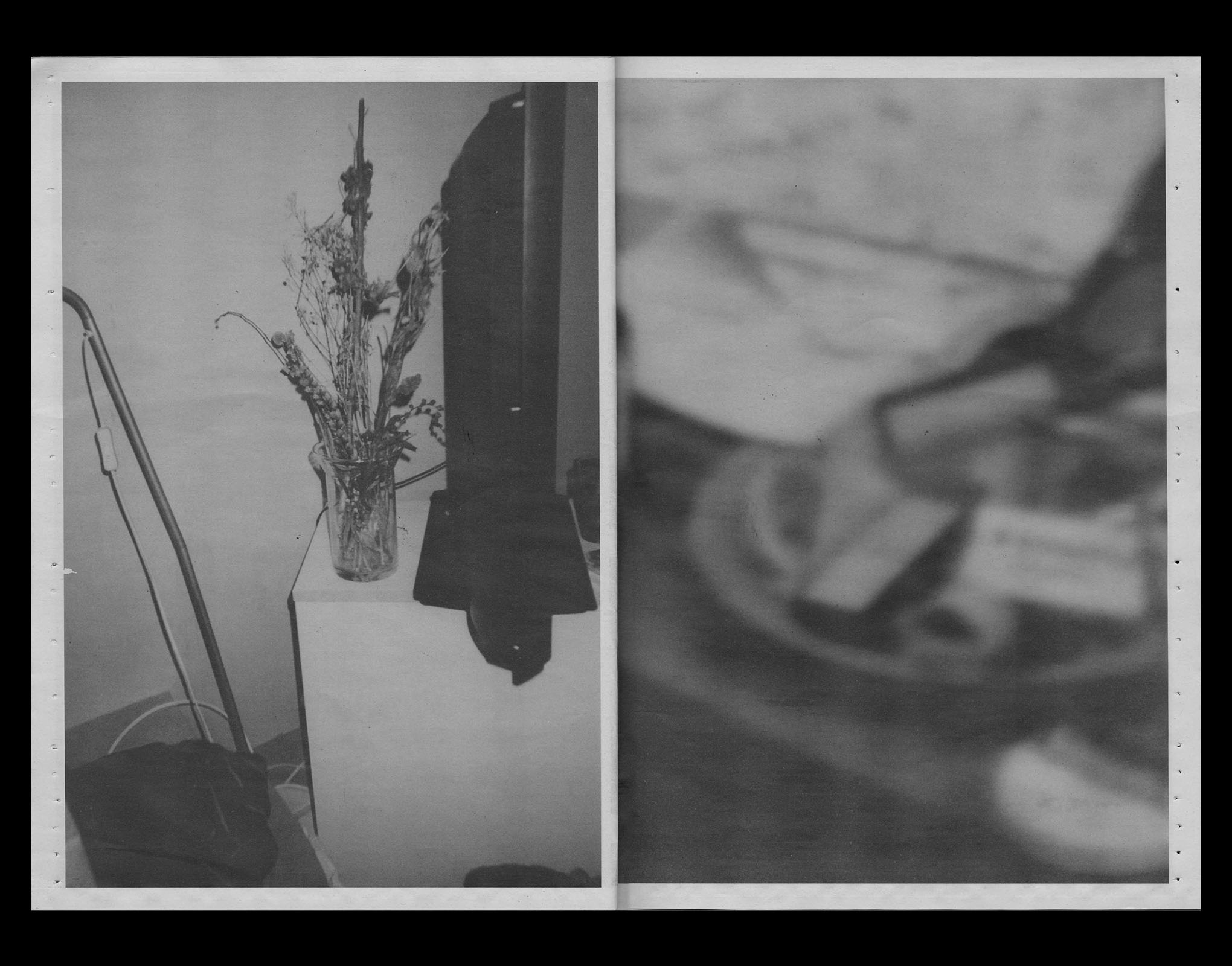
ghosts don’t like new things, Minne Kersten
Publication design
40 pages, 289×210 mm, newspaper printing
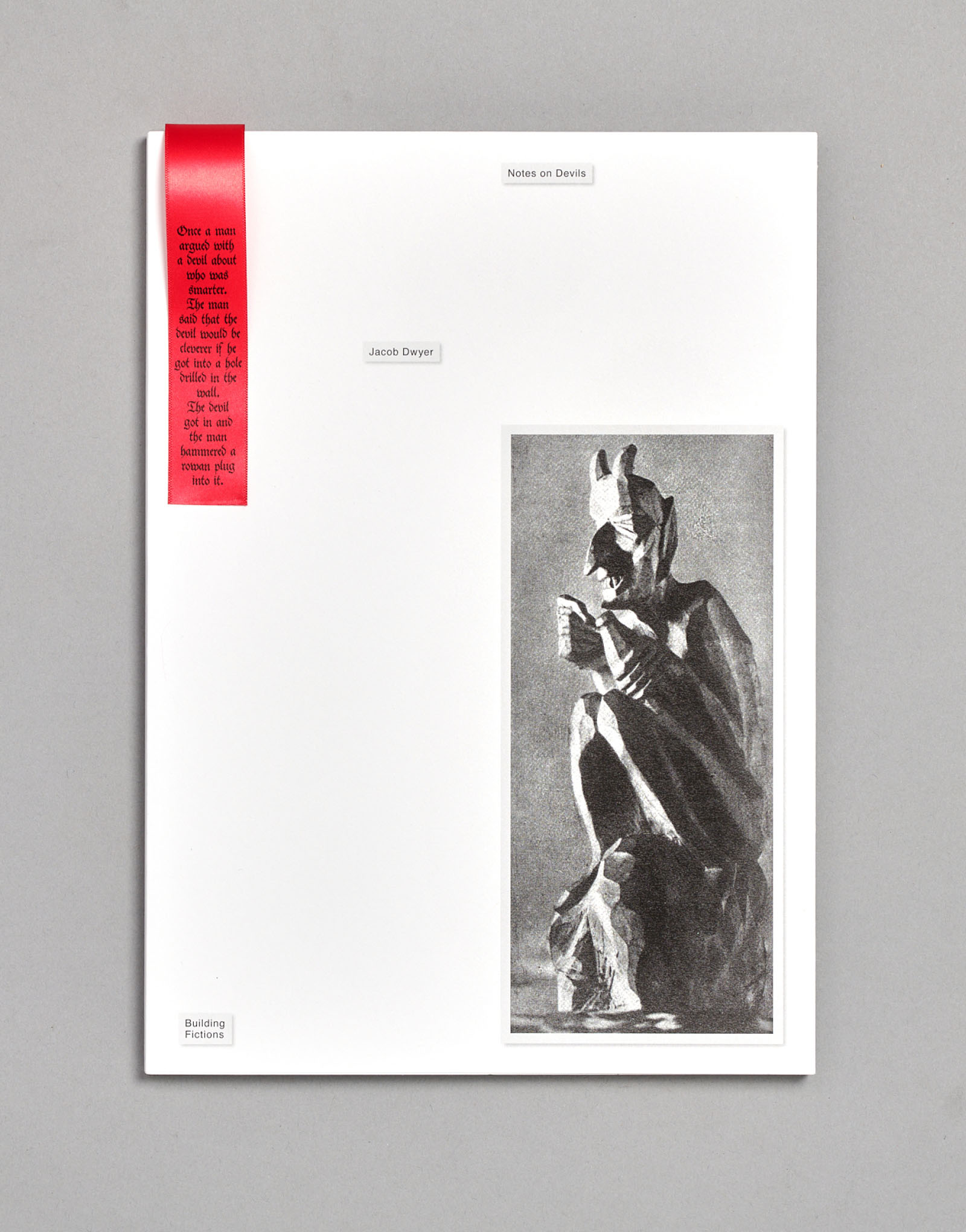
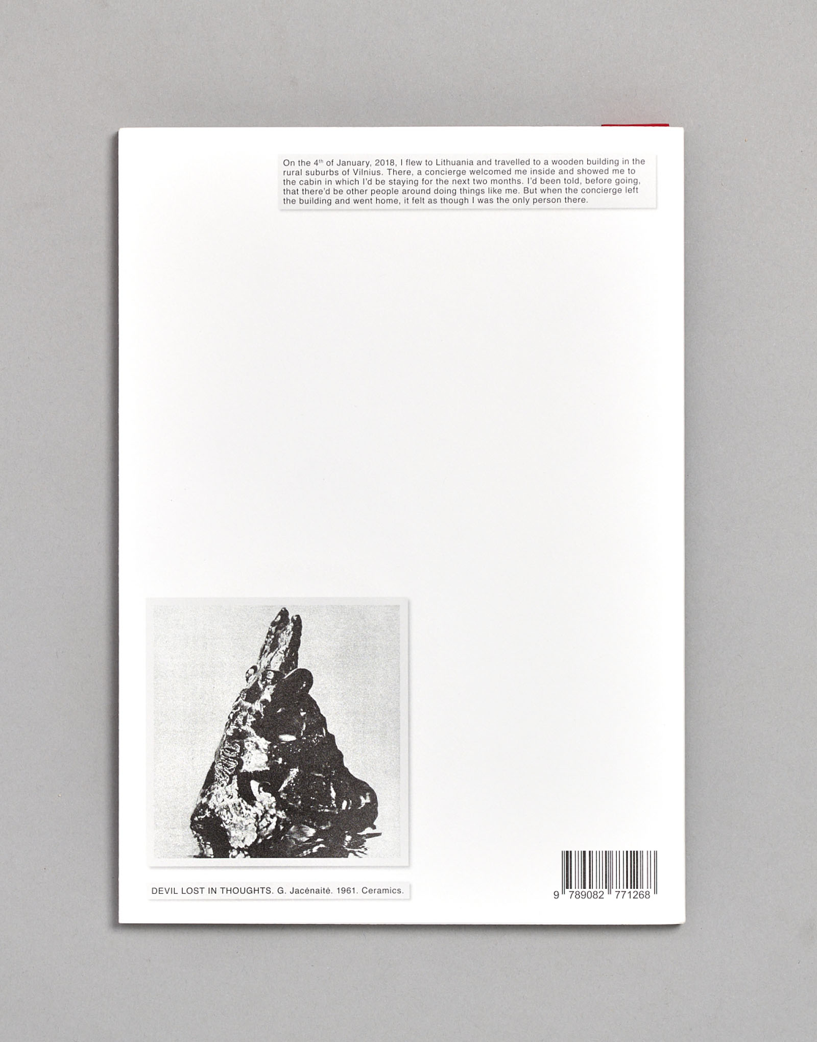
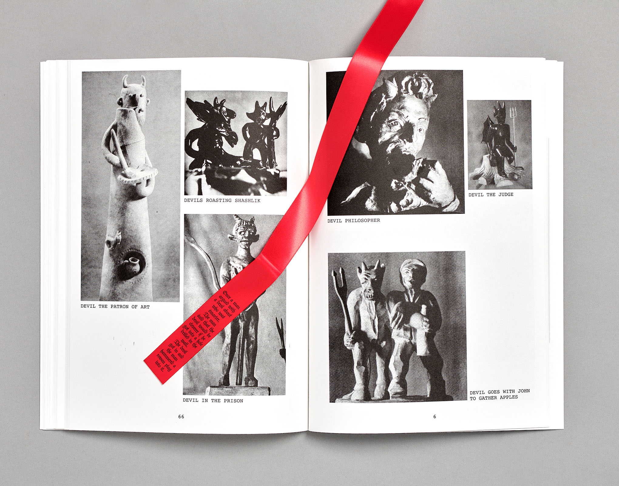
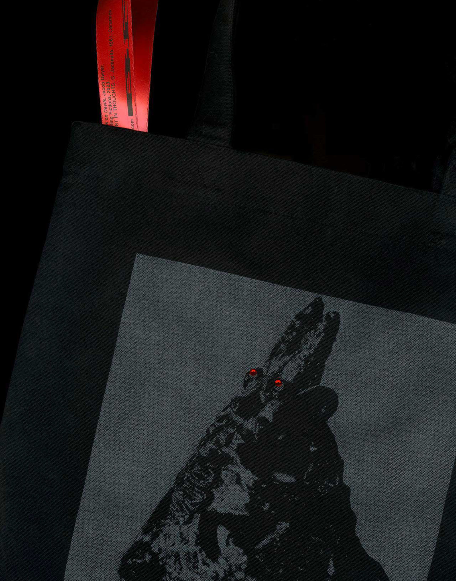
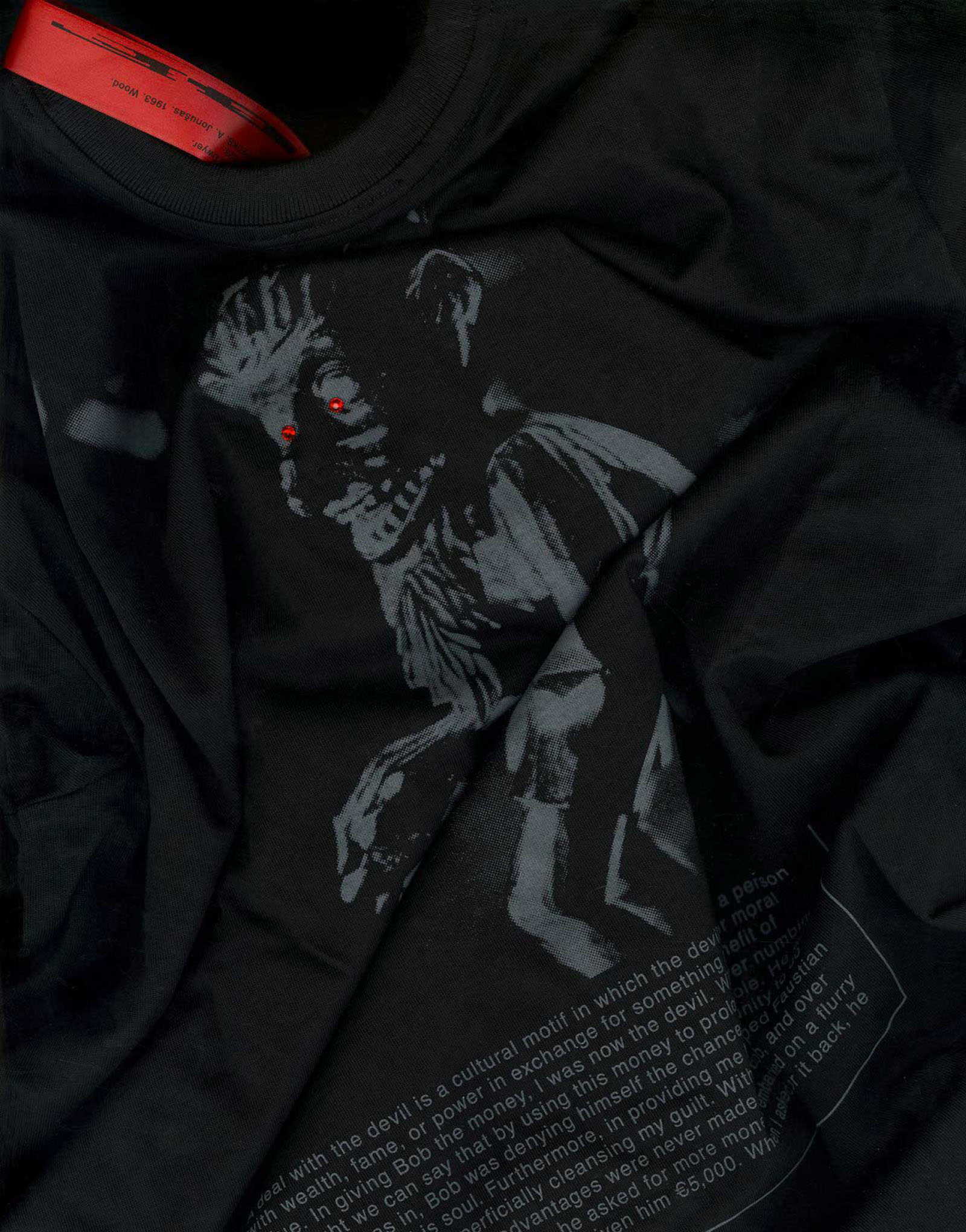
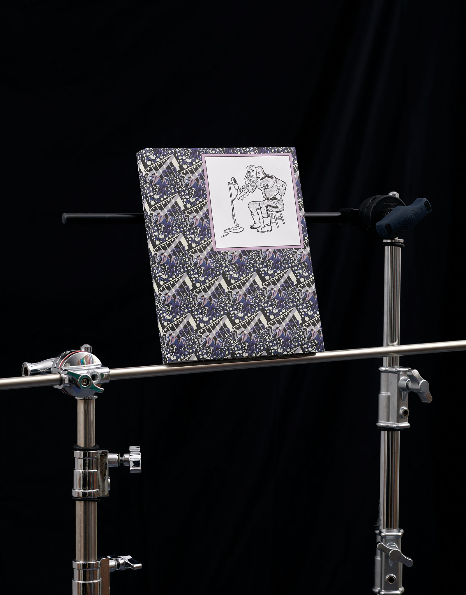
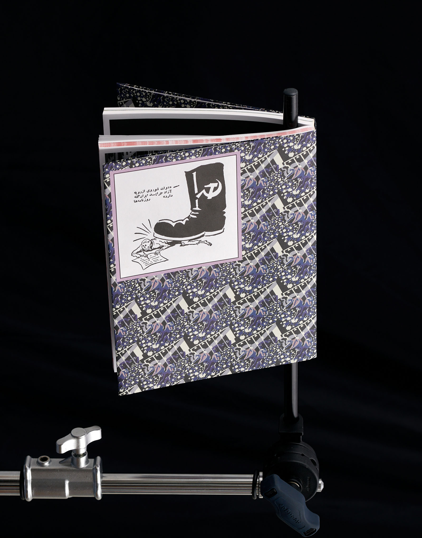
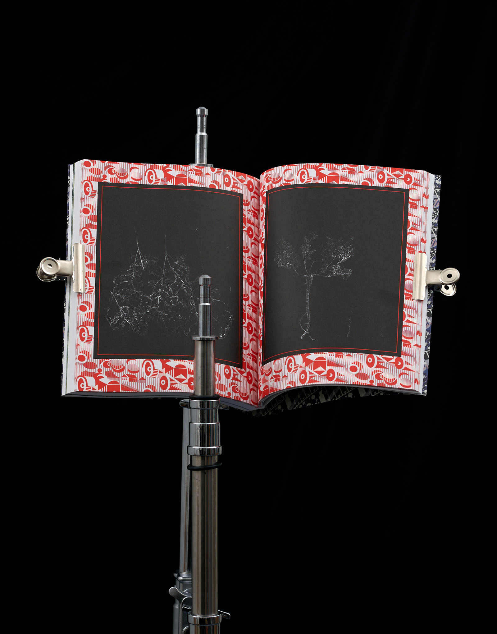
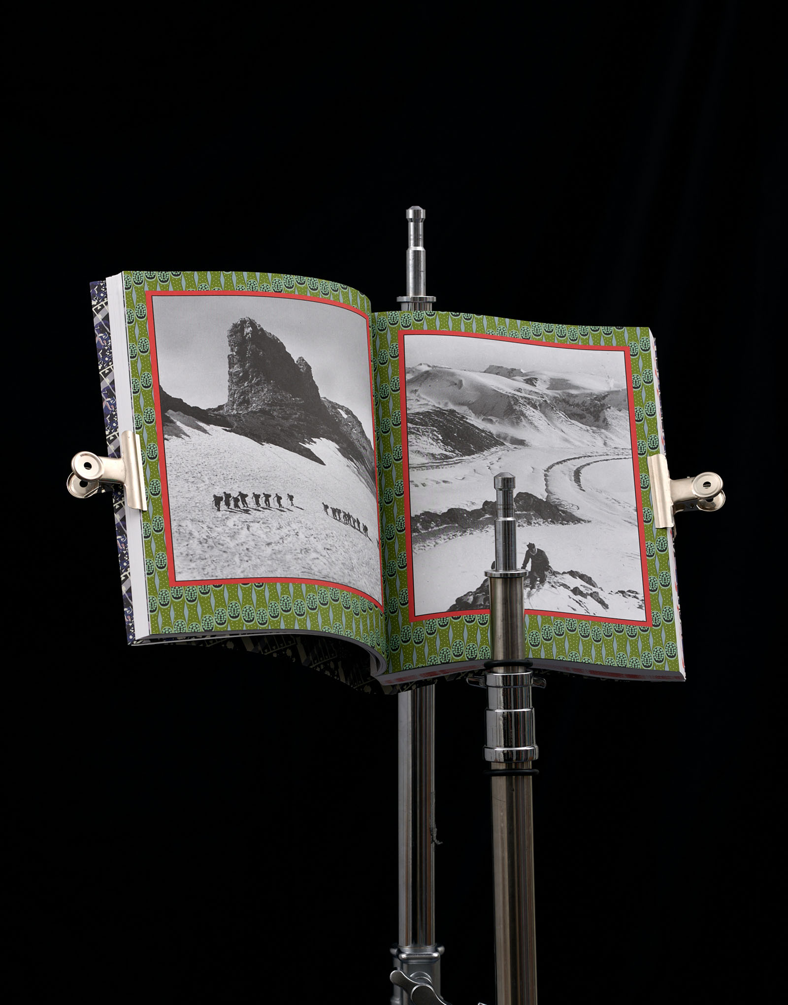
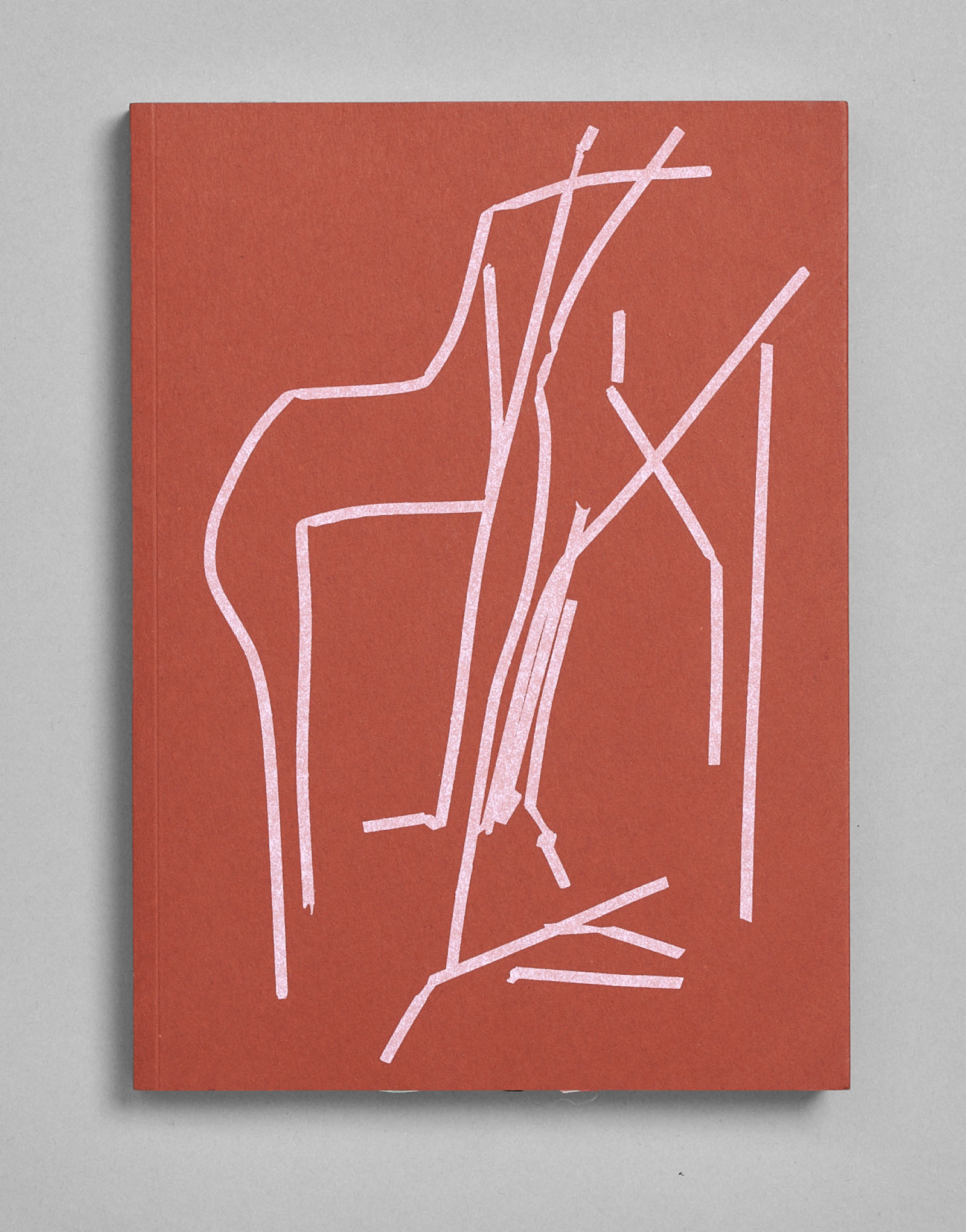
Notes on Devils, Jacob Dwyer, published by Building Fictions
Publication design and publishing
80 pages, 210×297 mm
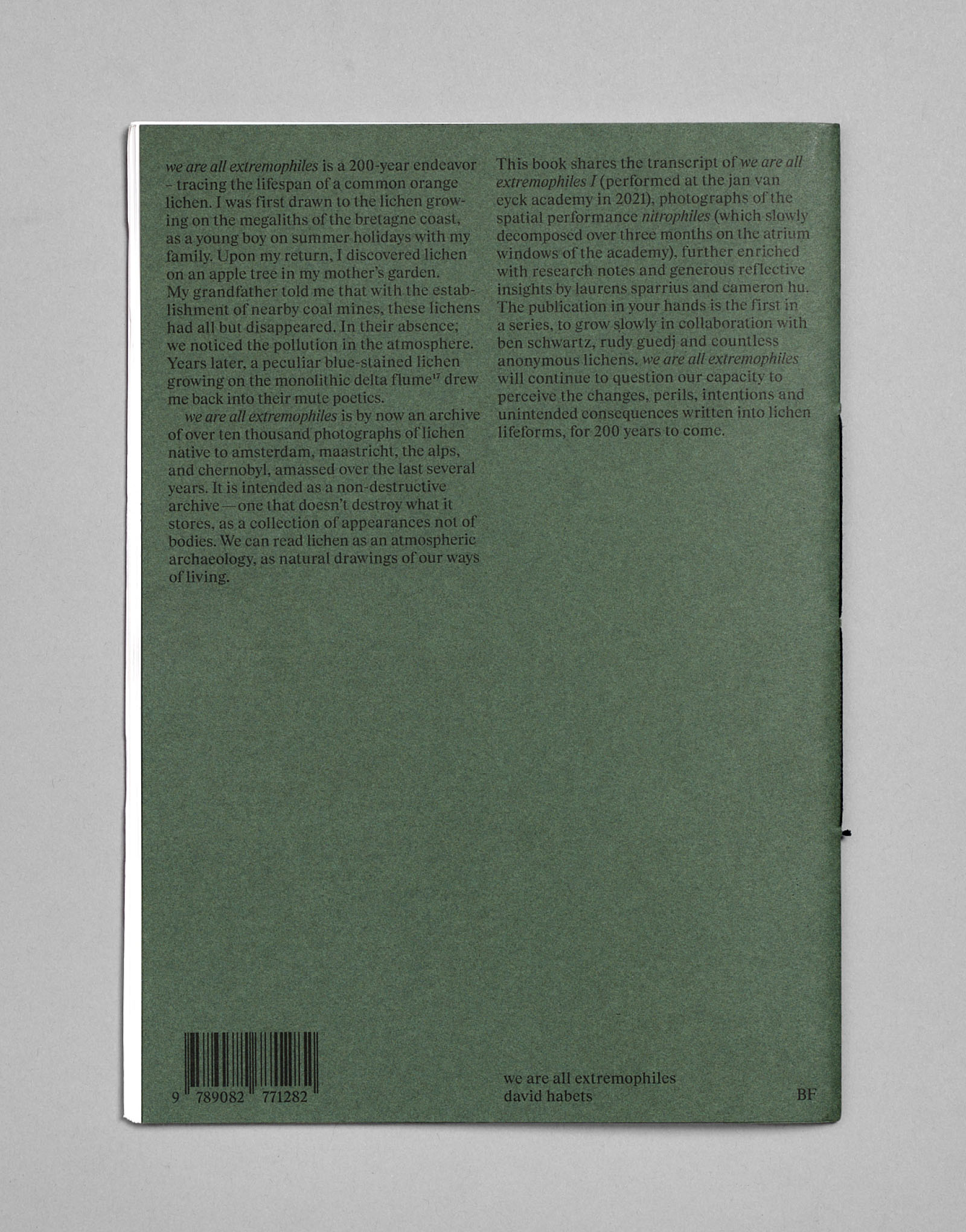
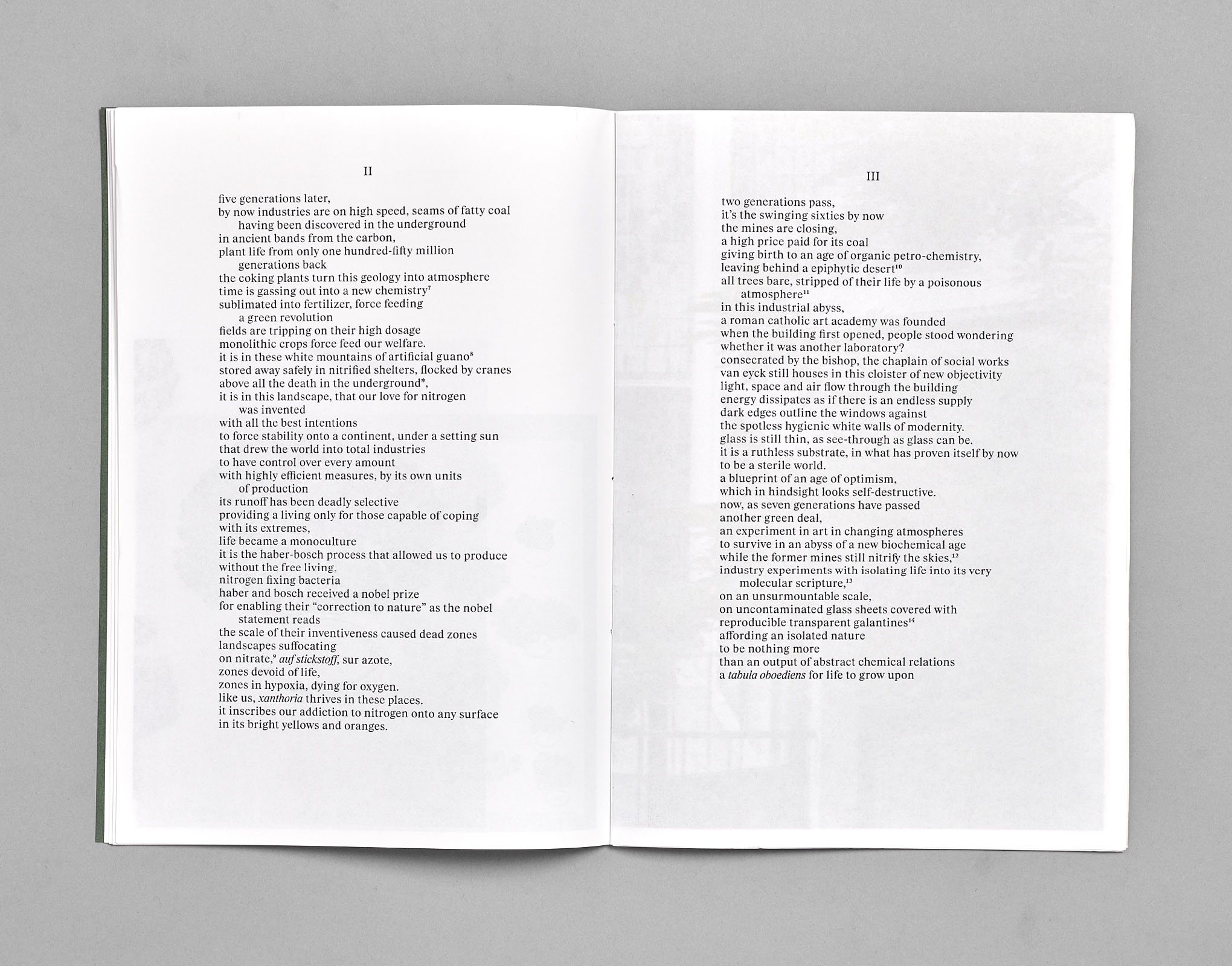
we are all extremophiles, David Habets, published by Building Fictions
Publication design and publishing, collab. Ben Schwartz
64 pages, 210×297 mm, riso printing

333, Lukas Rehm, published by Building Fictions
Publication design and publishing, collab. Tatjana Stürmer
252 pages, 220×310 mm
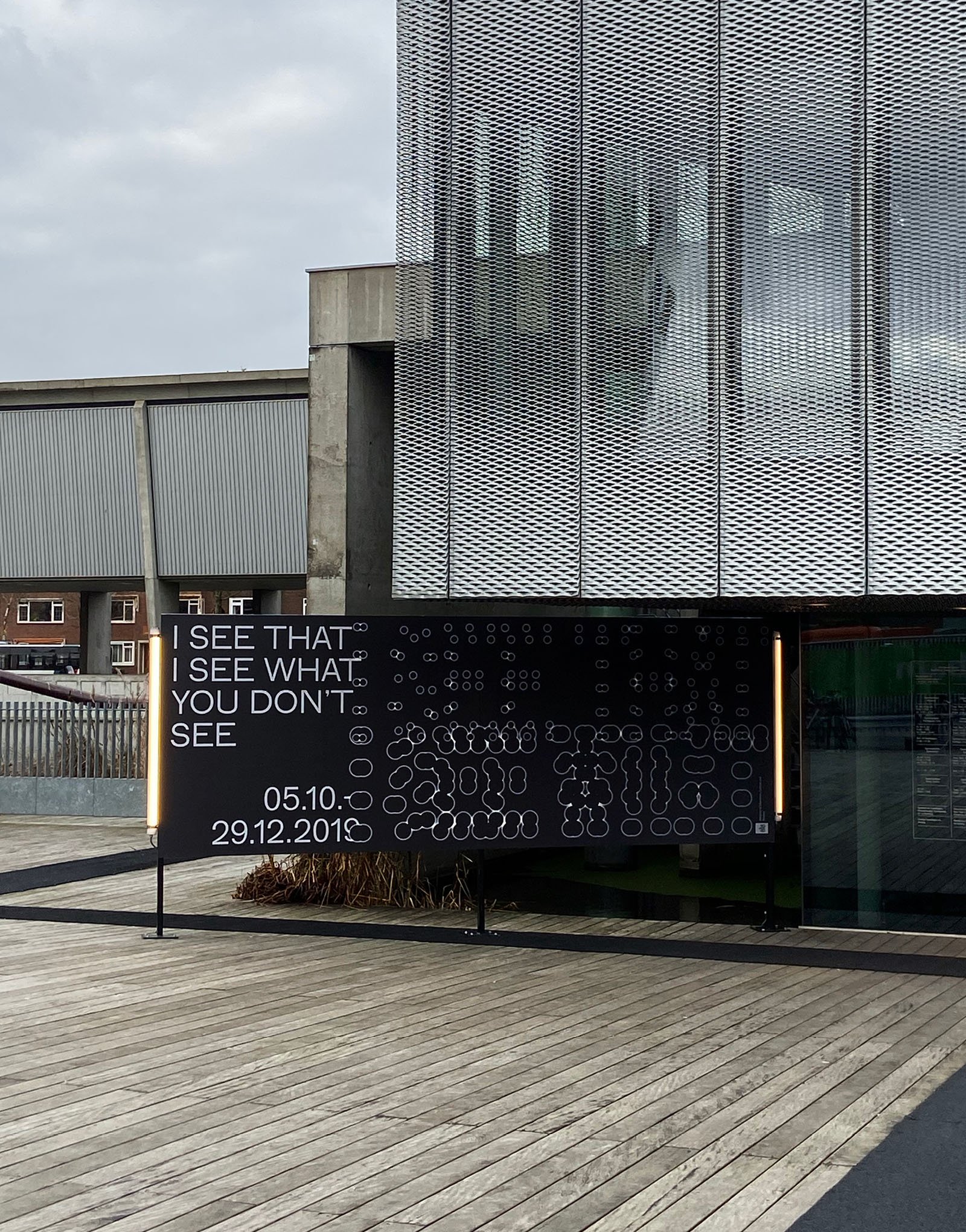
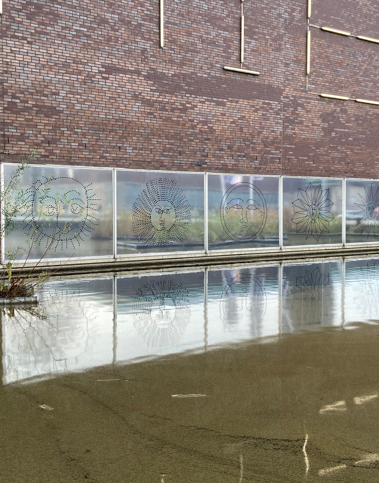
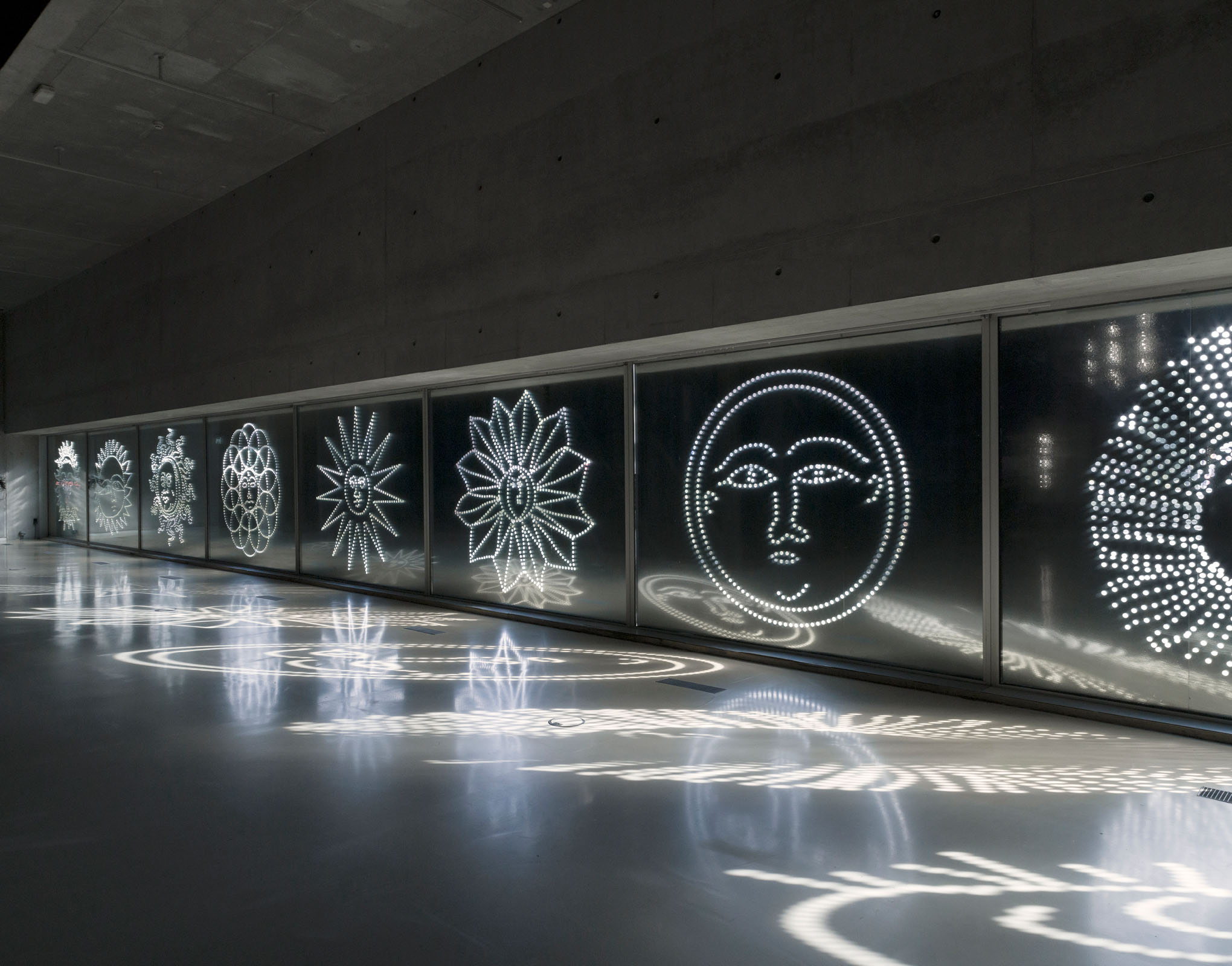
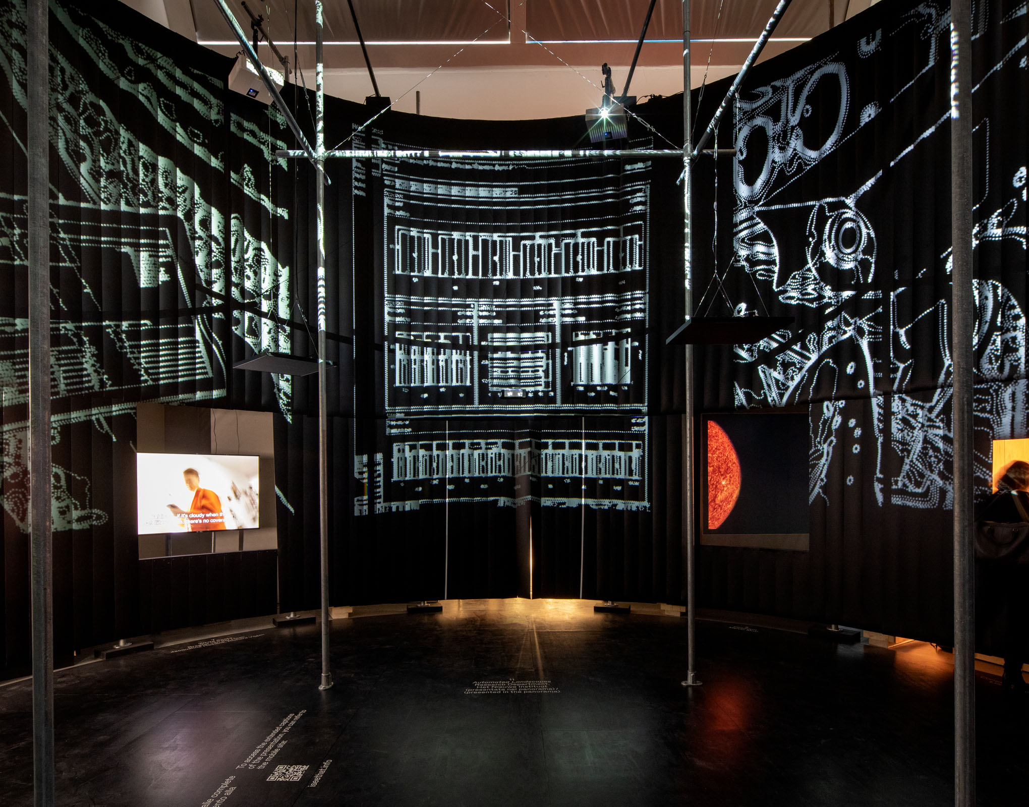
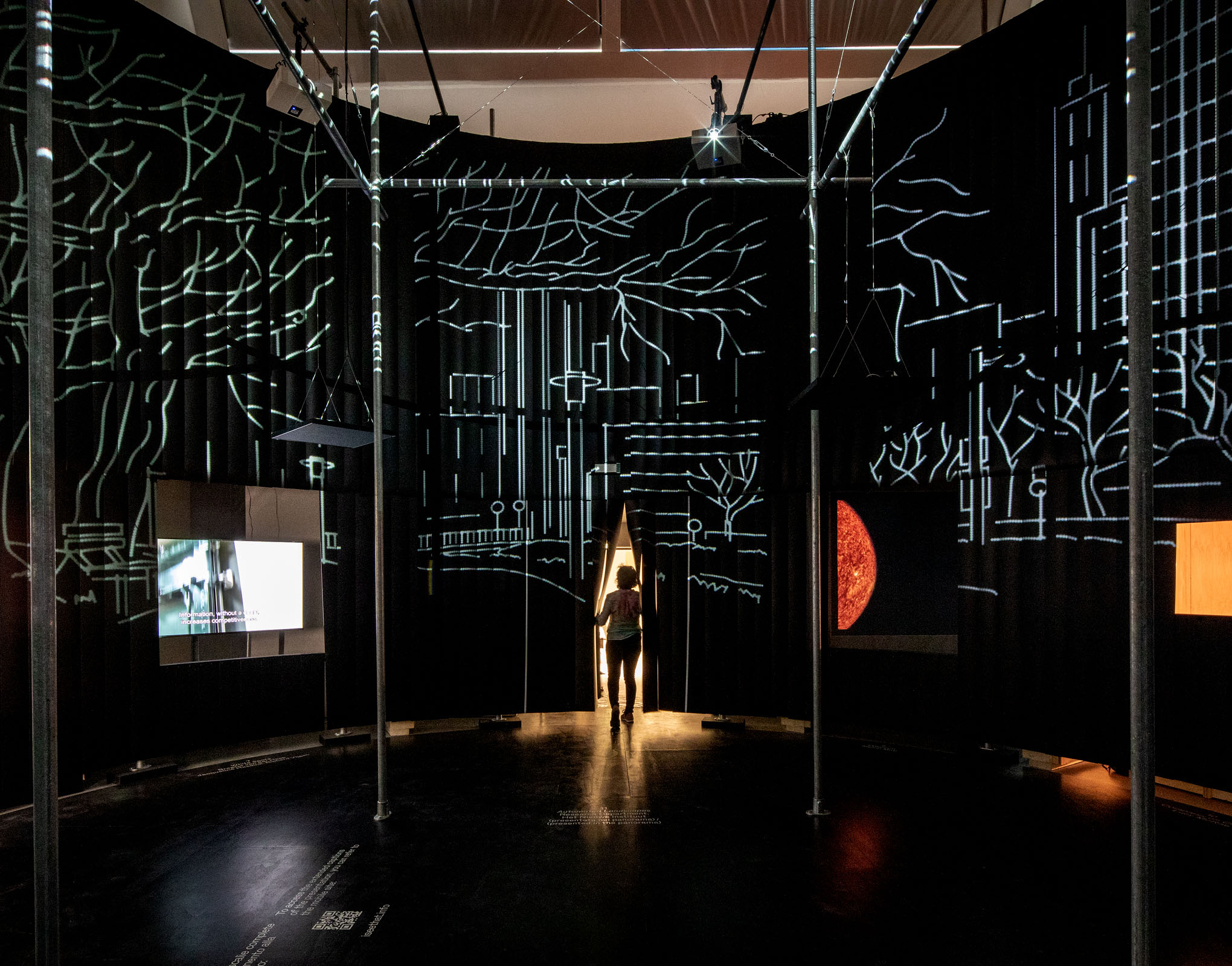
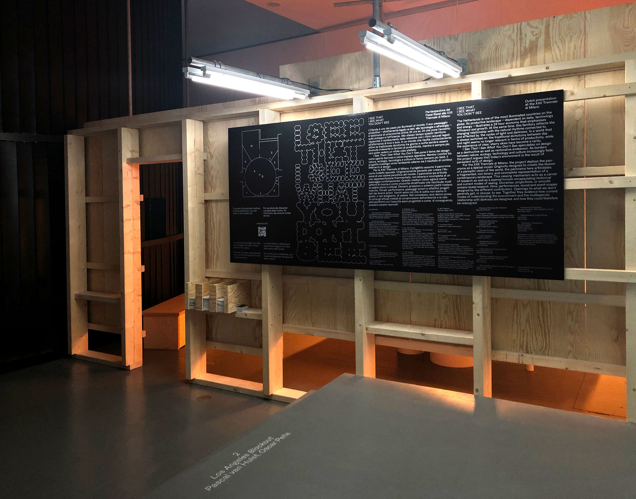
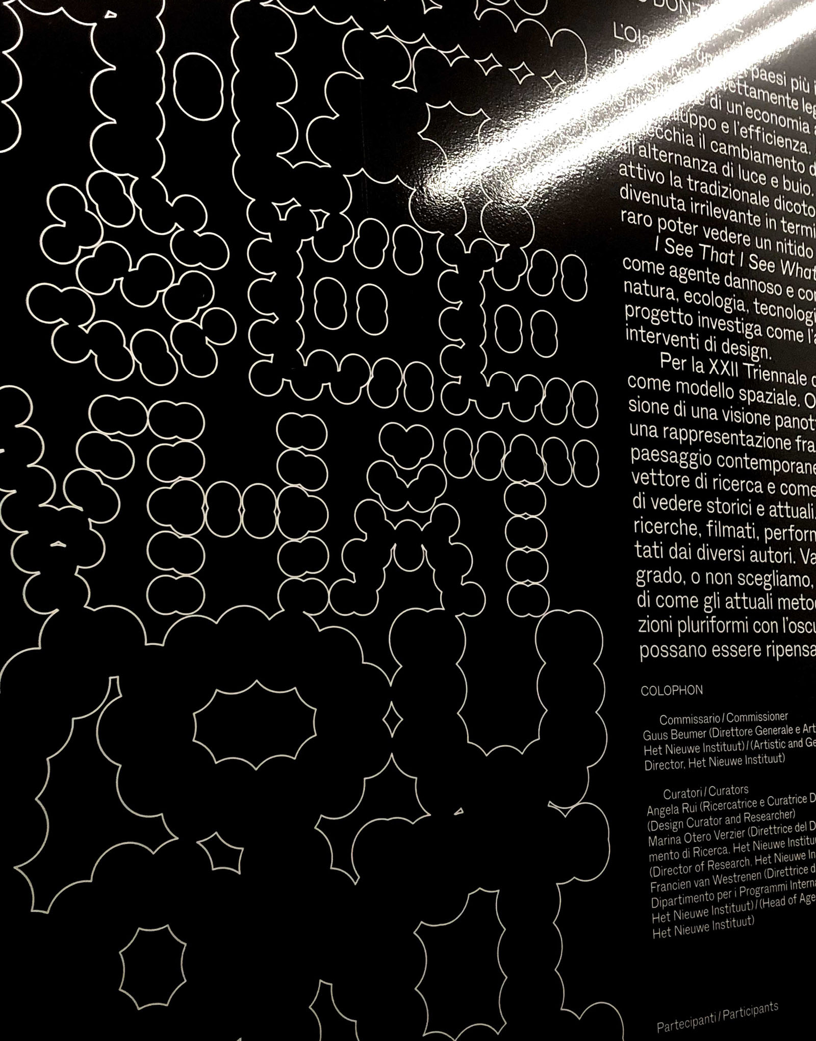
I See That I See What You Don't See, Dutch pavilion at the Milan Design Triennale, 2019
Exhibition design and identity, animation, scenography, collab. Olivier Goethals
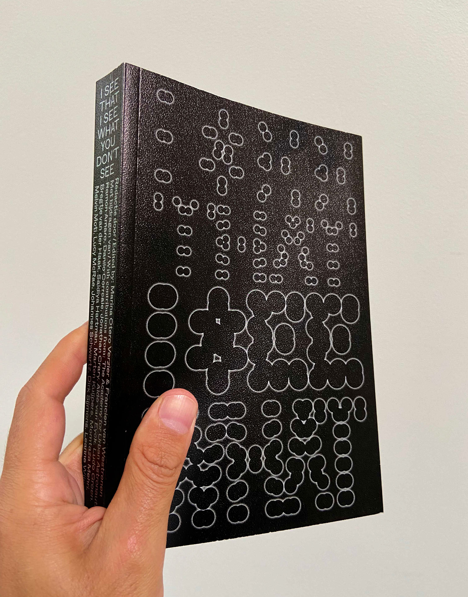
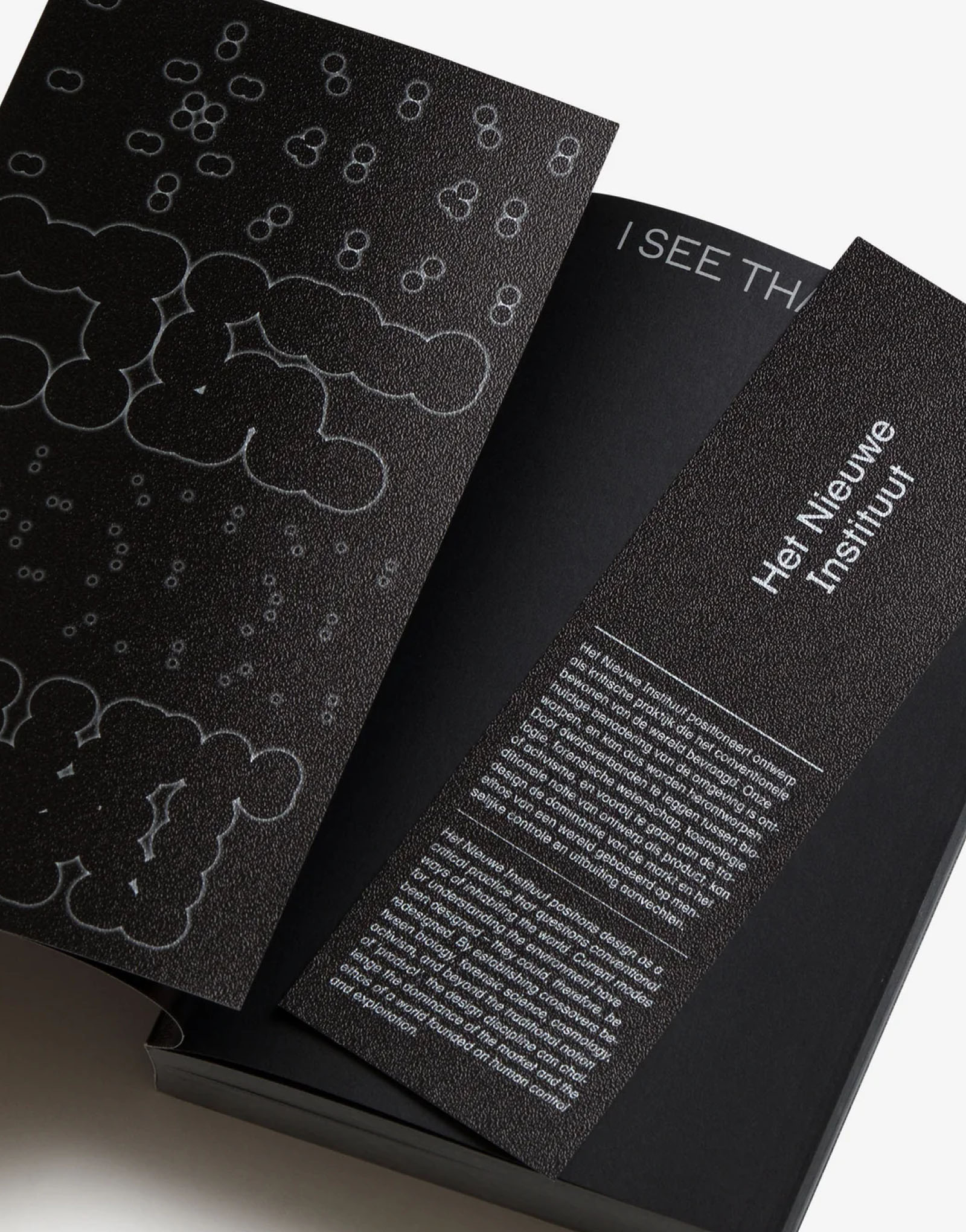
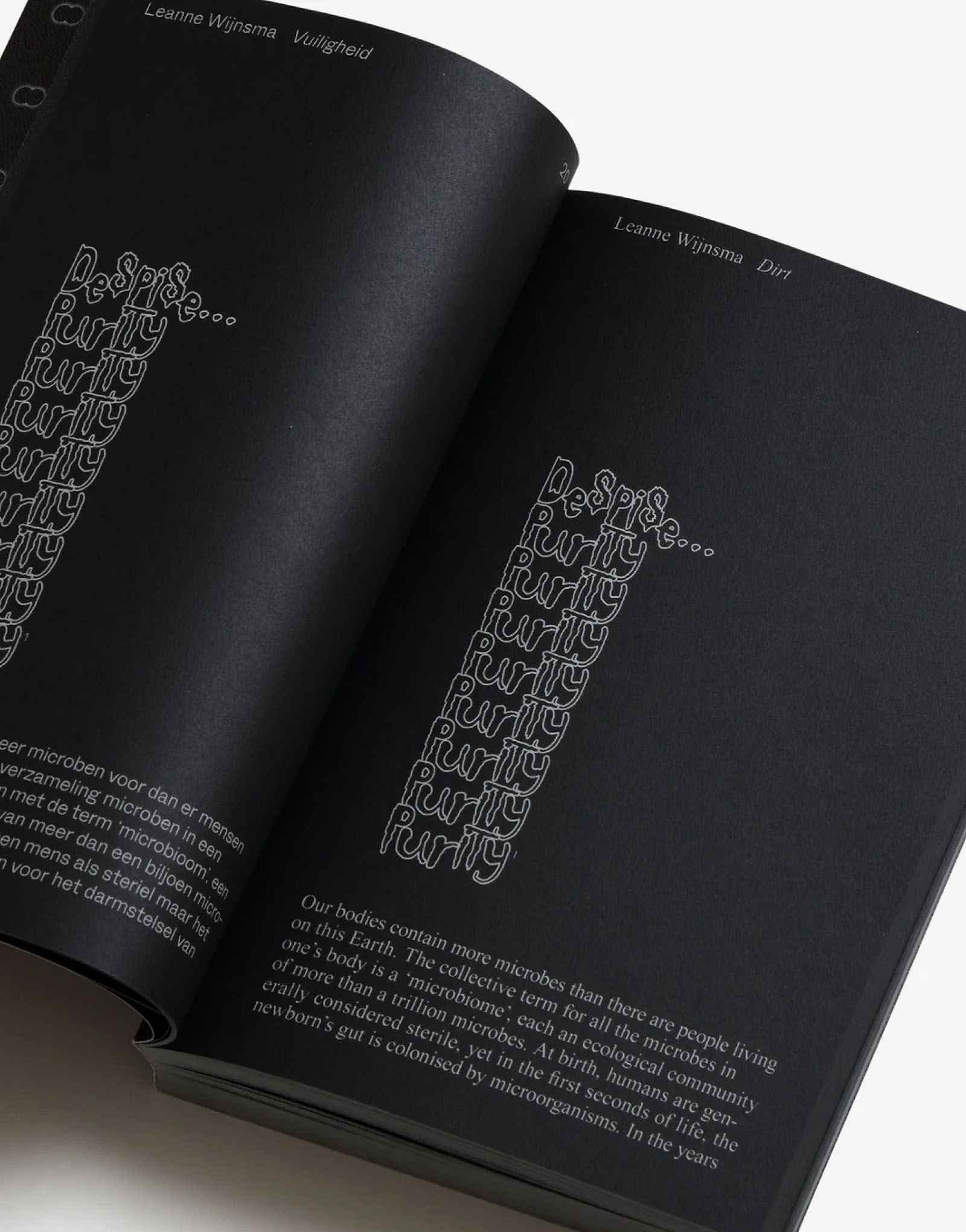
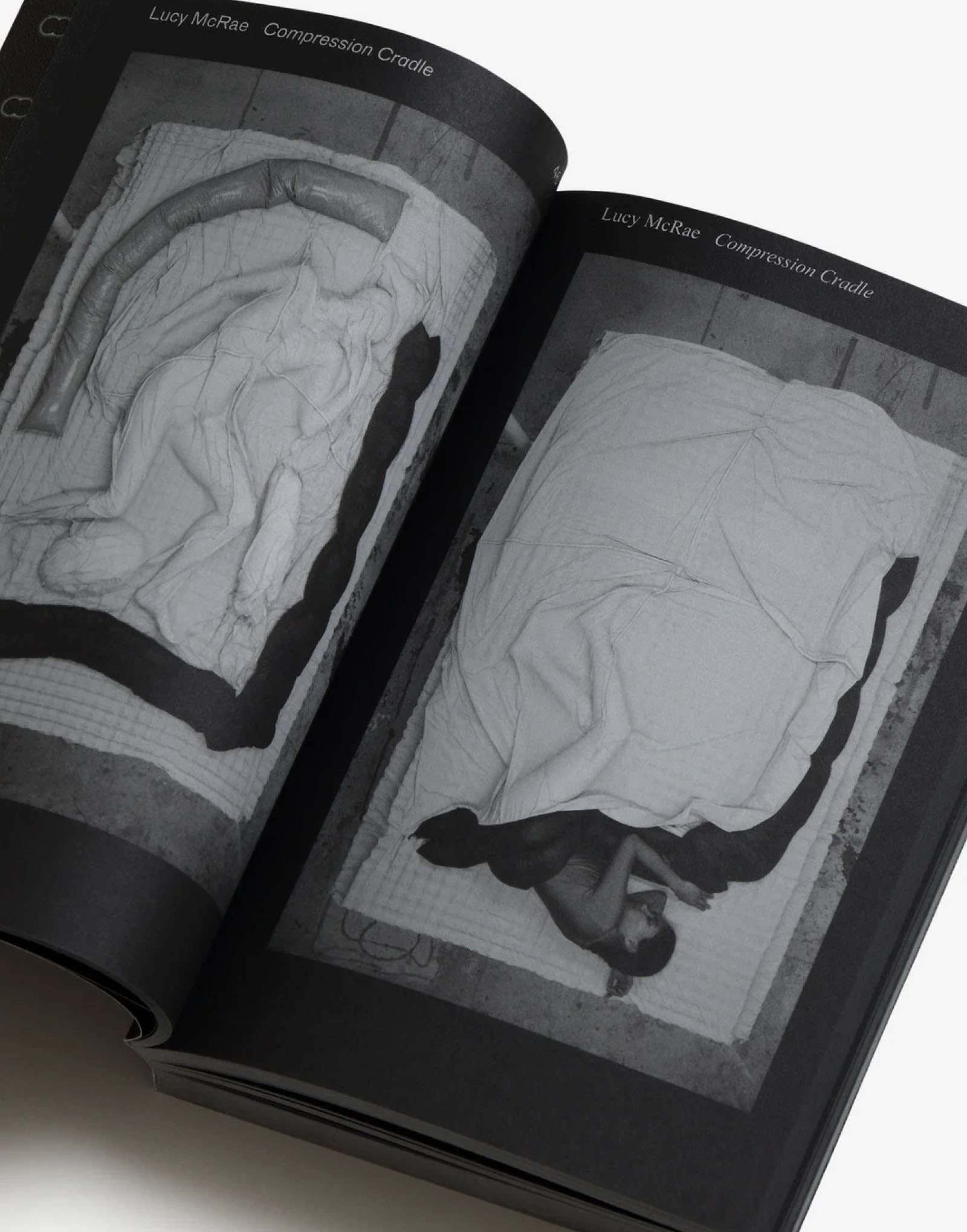
I See That I See What You Don't See, reader, Dutch pavilion at the Milan Design Triennale, 2019
Publication design
416 pages, 135×200 mm

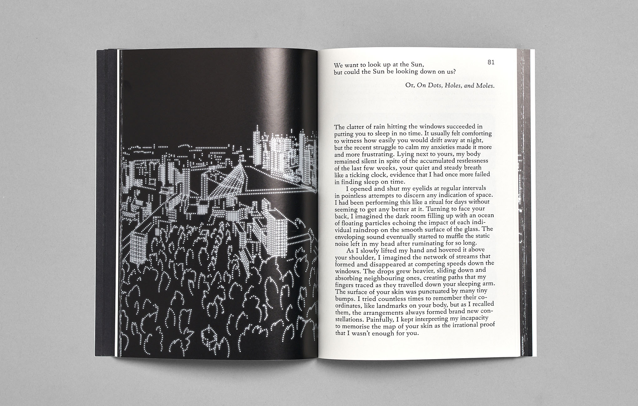
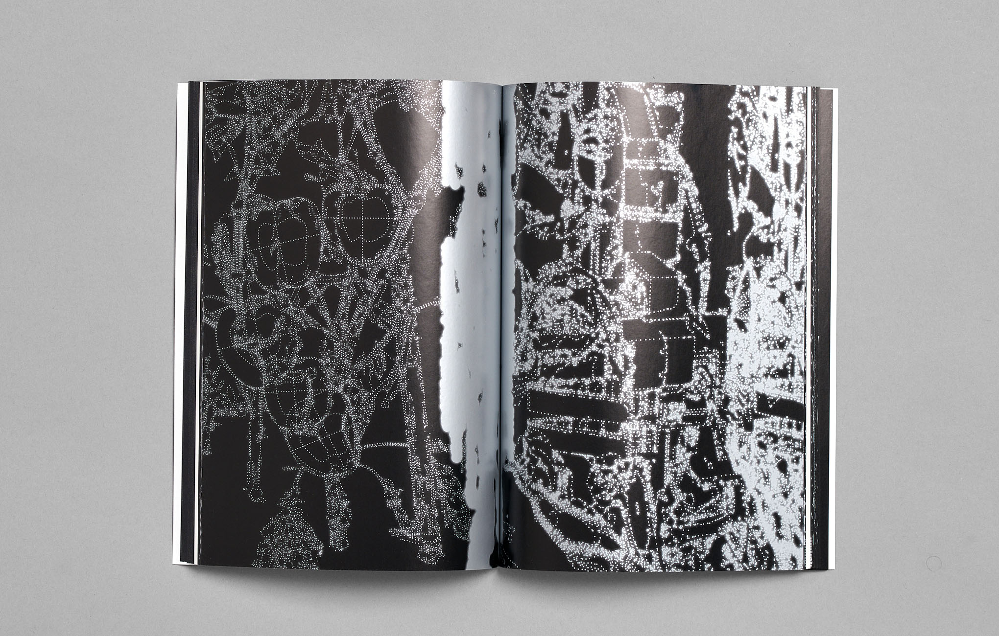
We want to look up at the Sun, but could the Sun be looking down on us, Rudy Guedj and Olivier Goethals, published by Building Fictions
Publication design, writing, drawing, publishing
144 pages, 170×240 mm
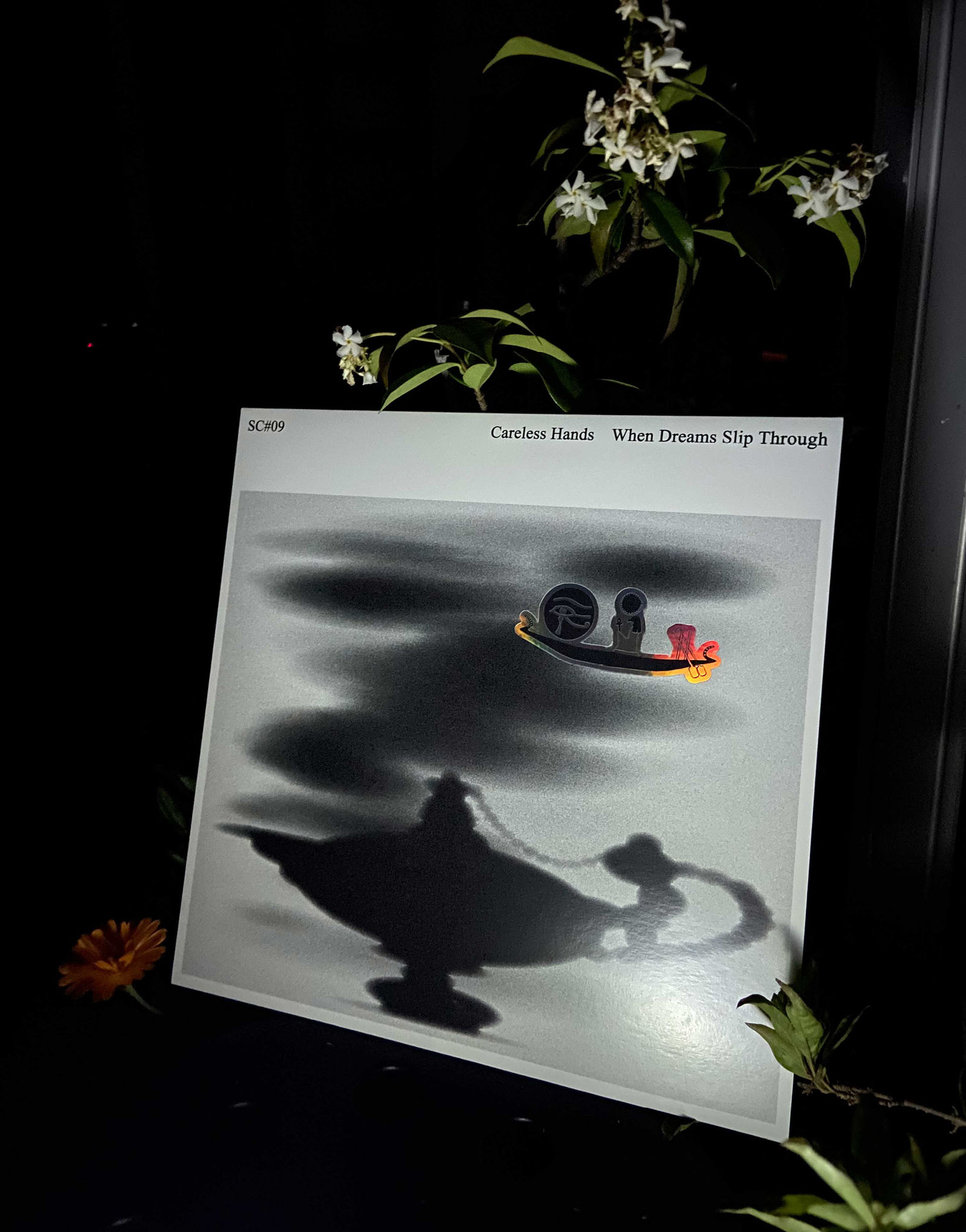
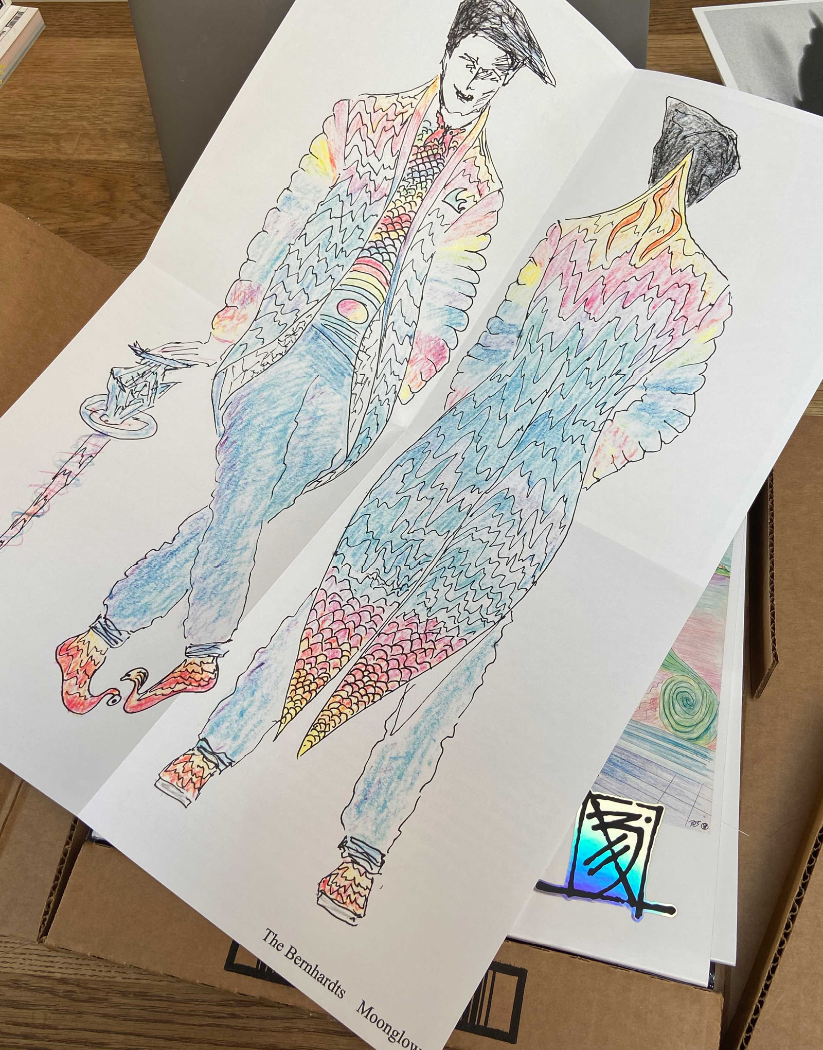
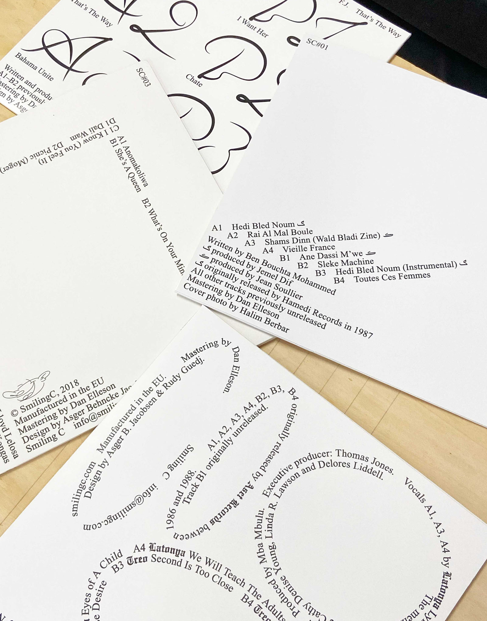
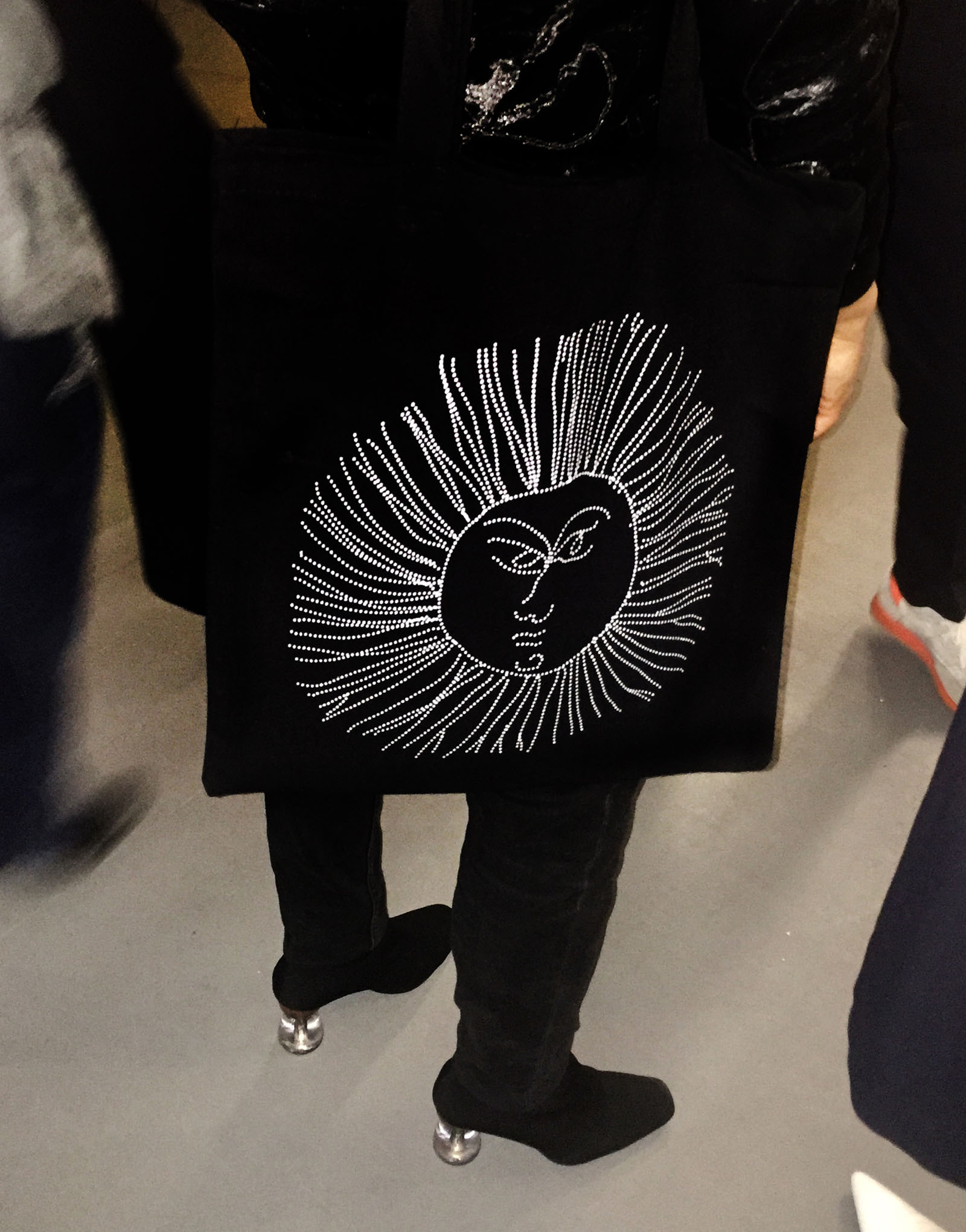
Ongoing art direction and design for Smiling C, collab. Asger Behncke
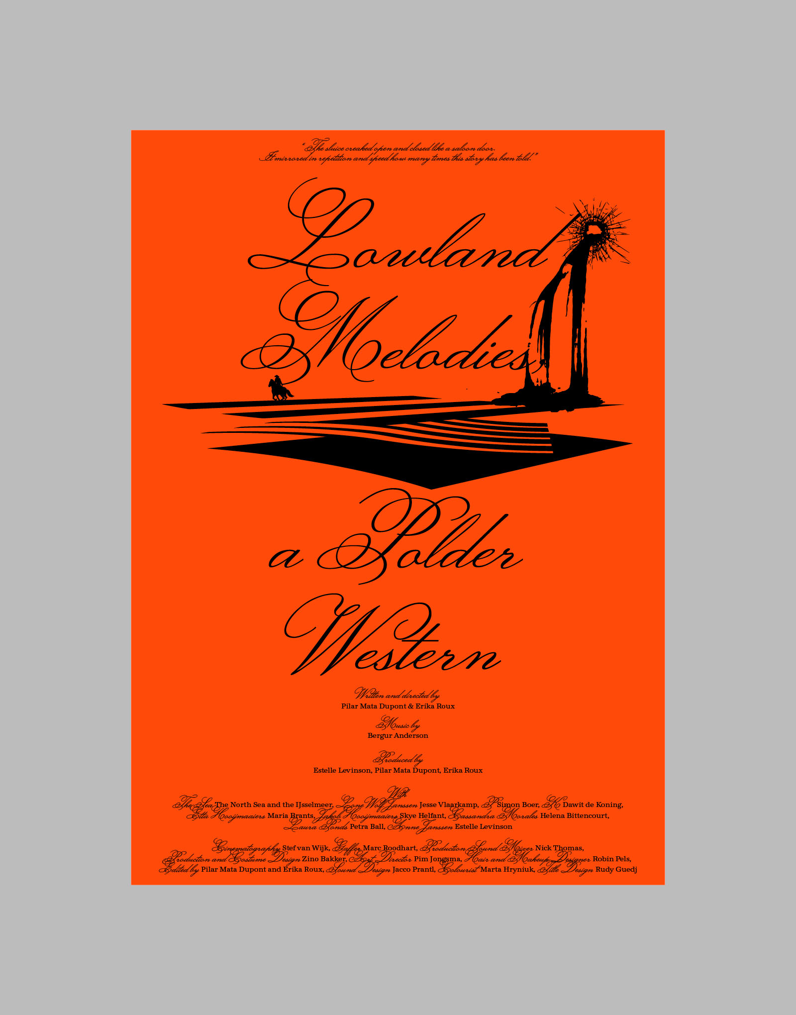
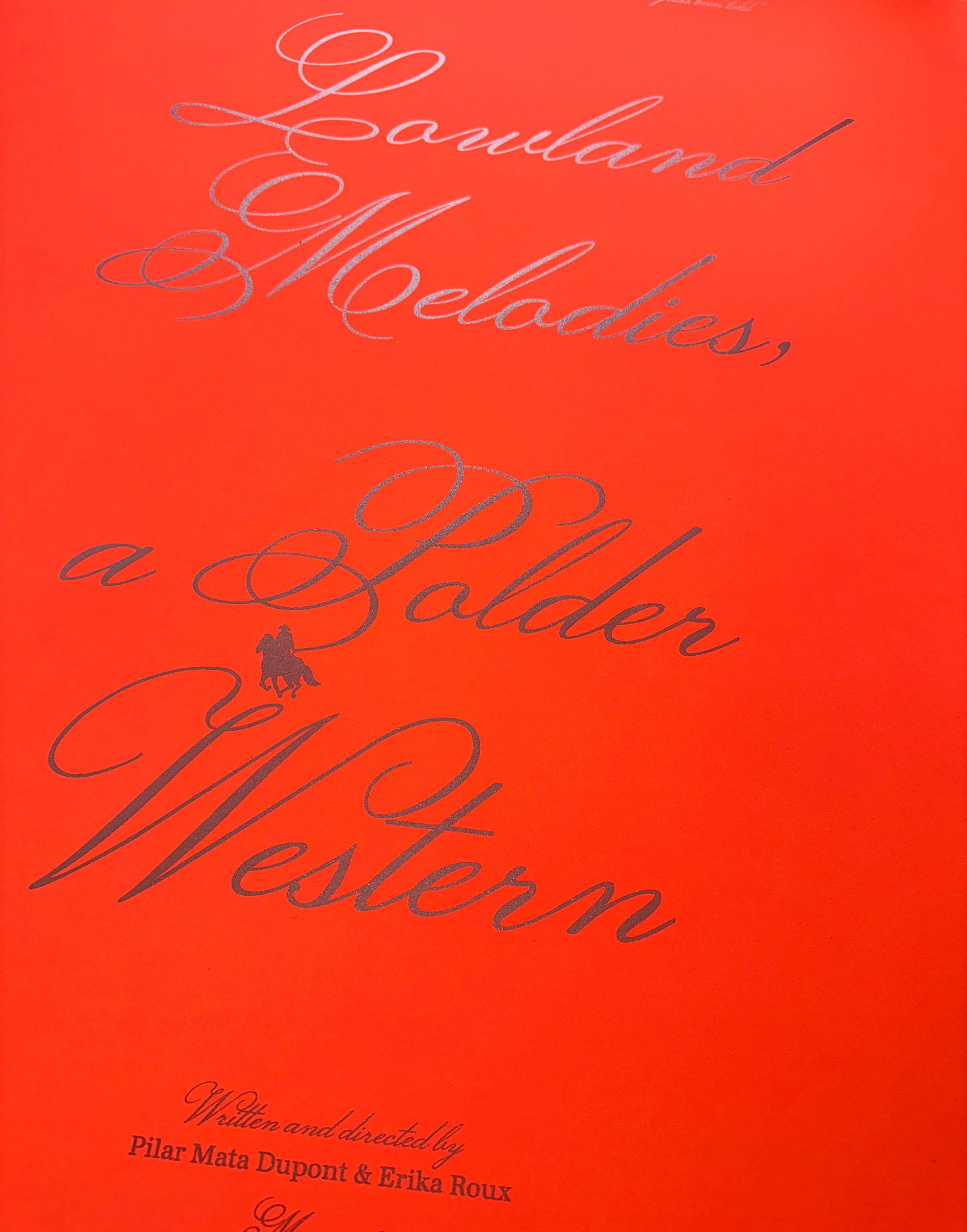
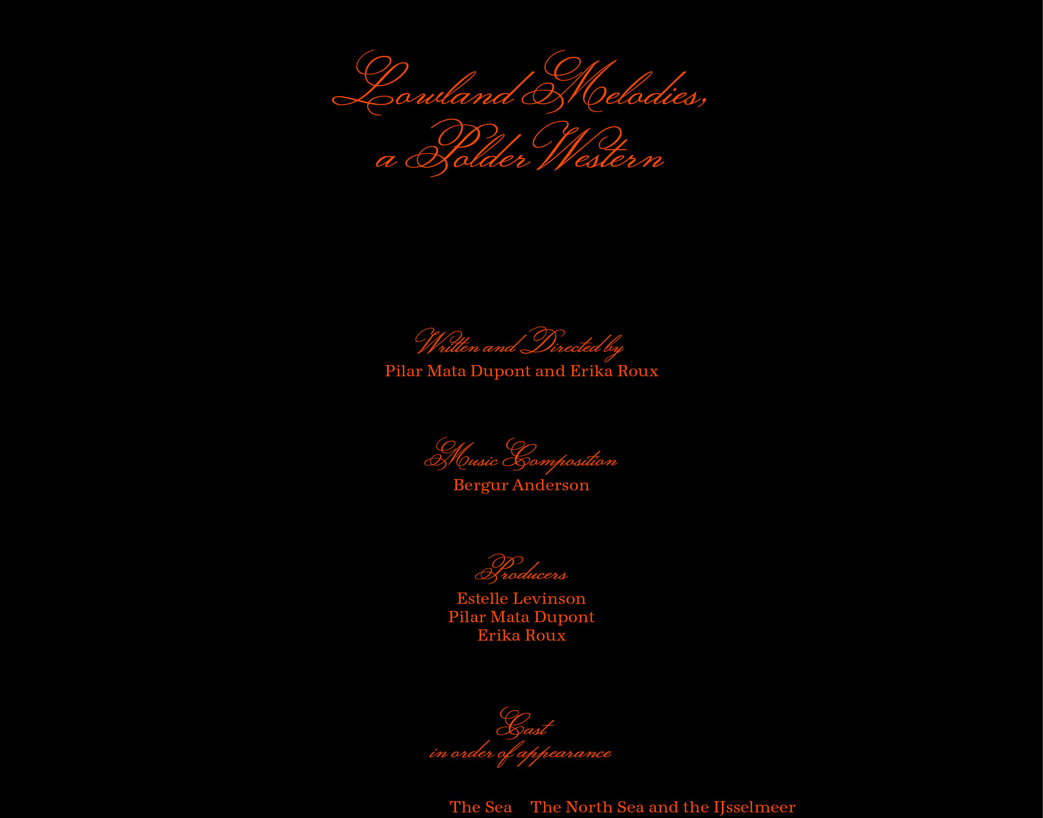
Scenes From The Polder Western, Erika Roux and Pilar Mata Dupont, 2024
Poster design, film titles and credits
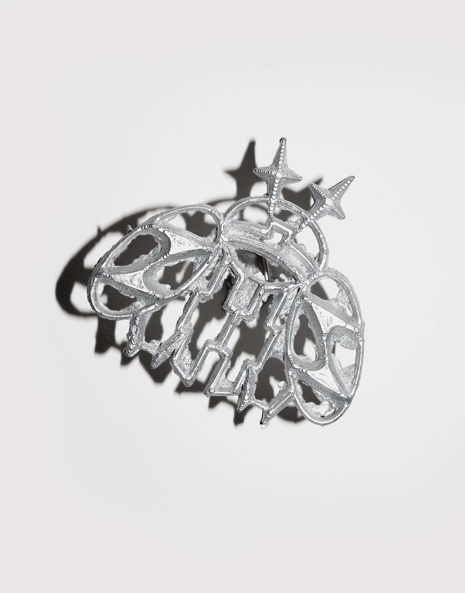
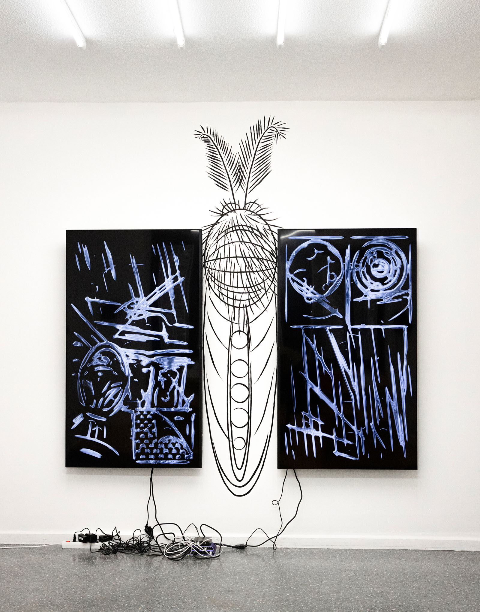
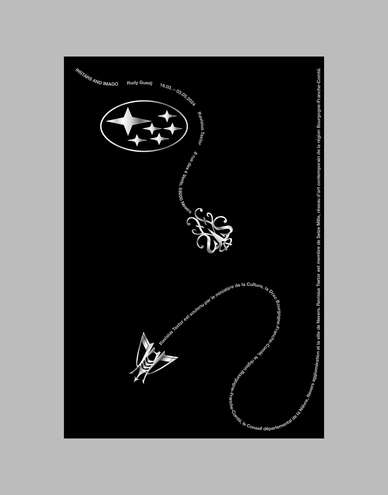
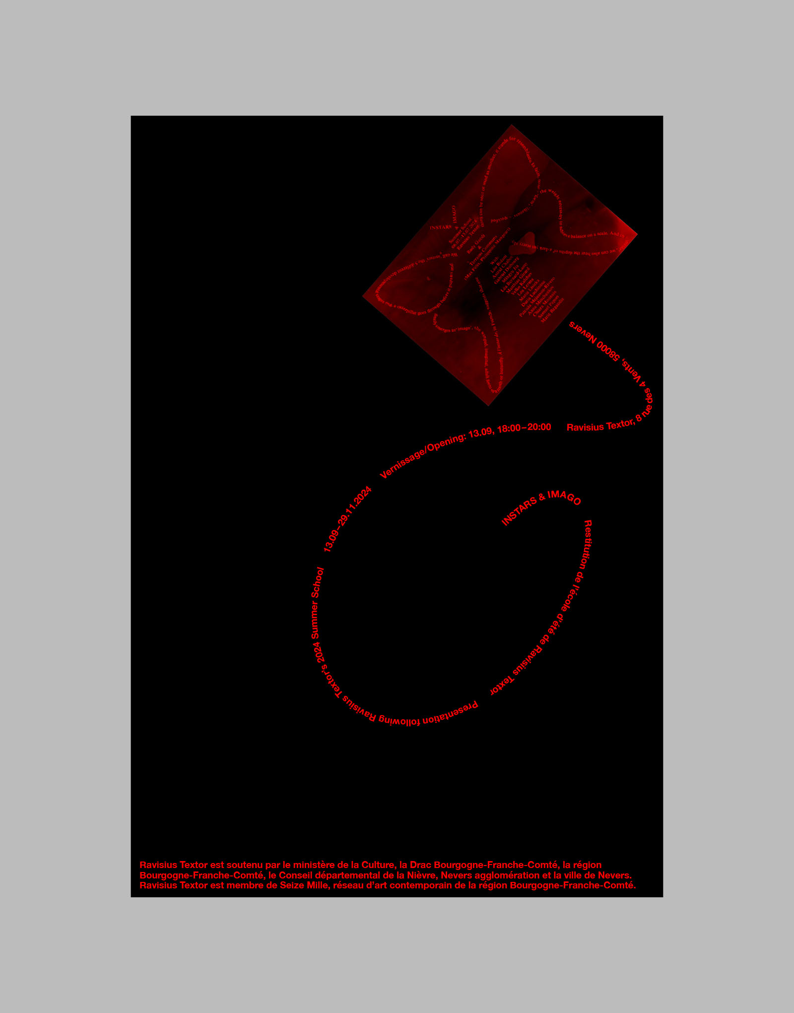
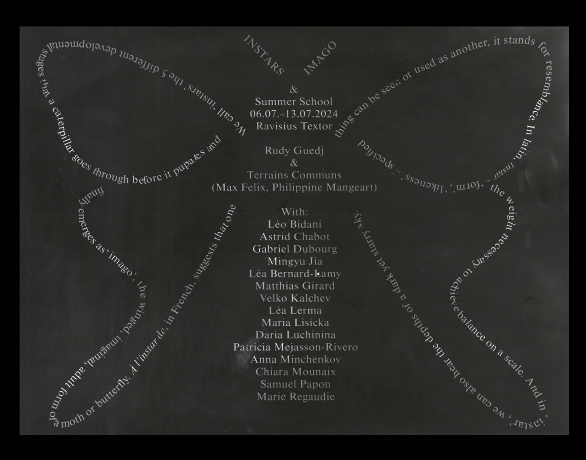
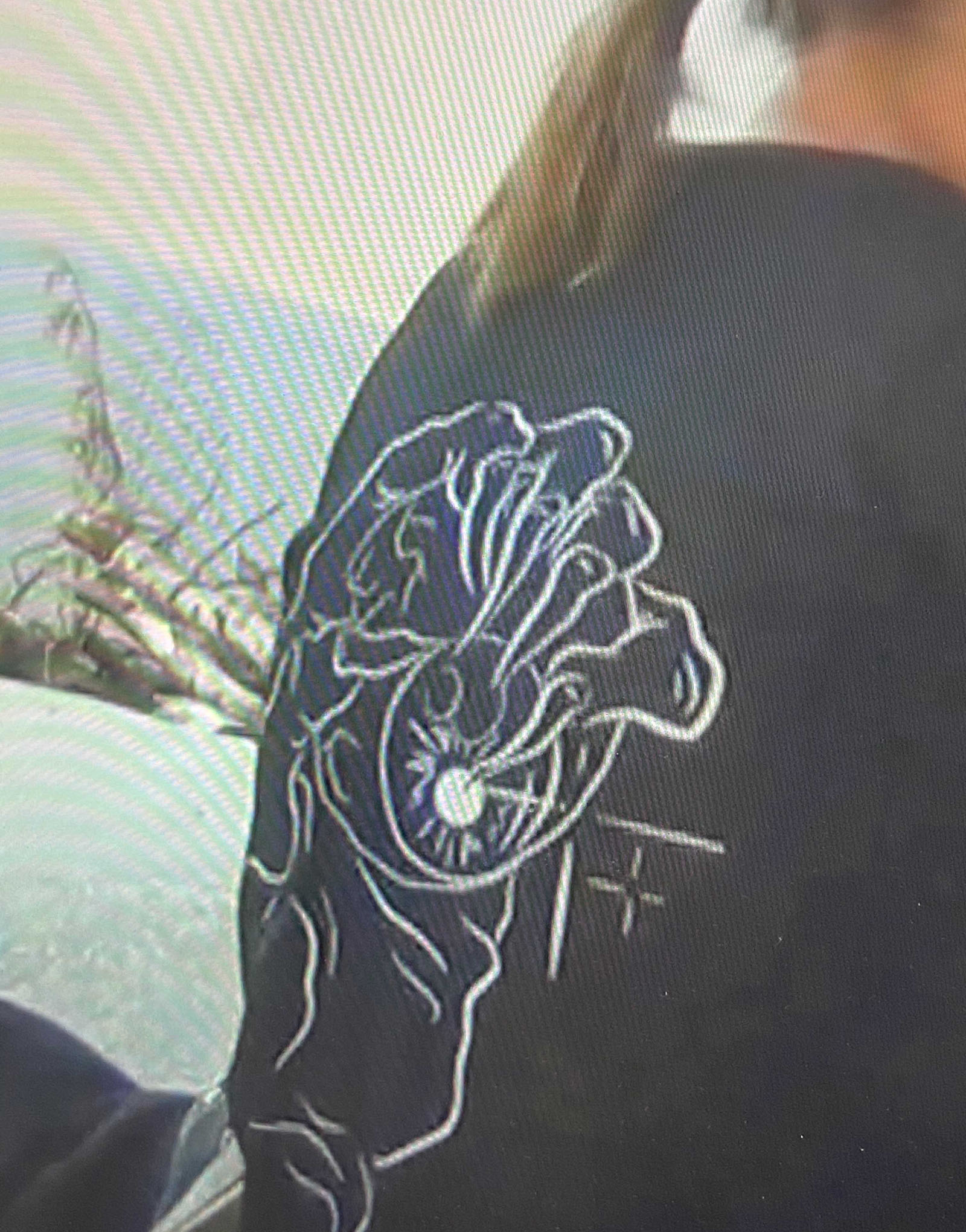
Instars and Imago, solo show at Ravisius Textor (FR), 2024
Installation, mural drawing, animation, poster design
(Photos by Max Felix)
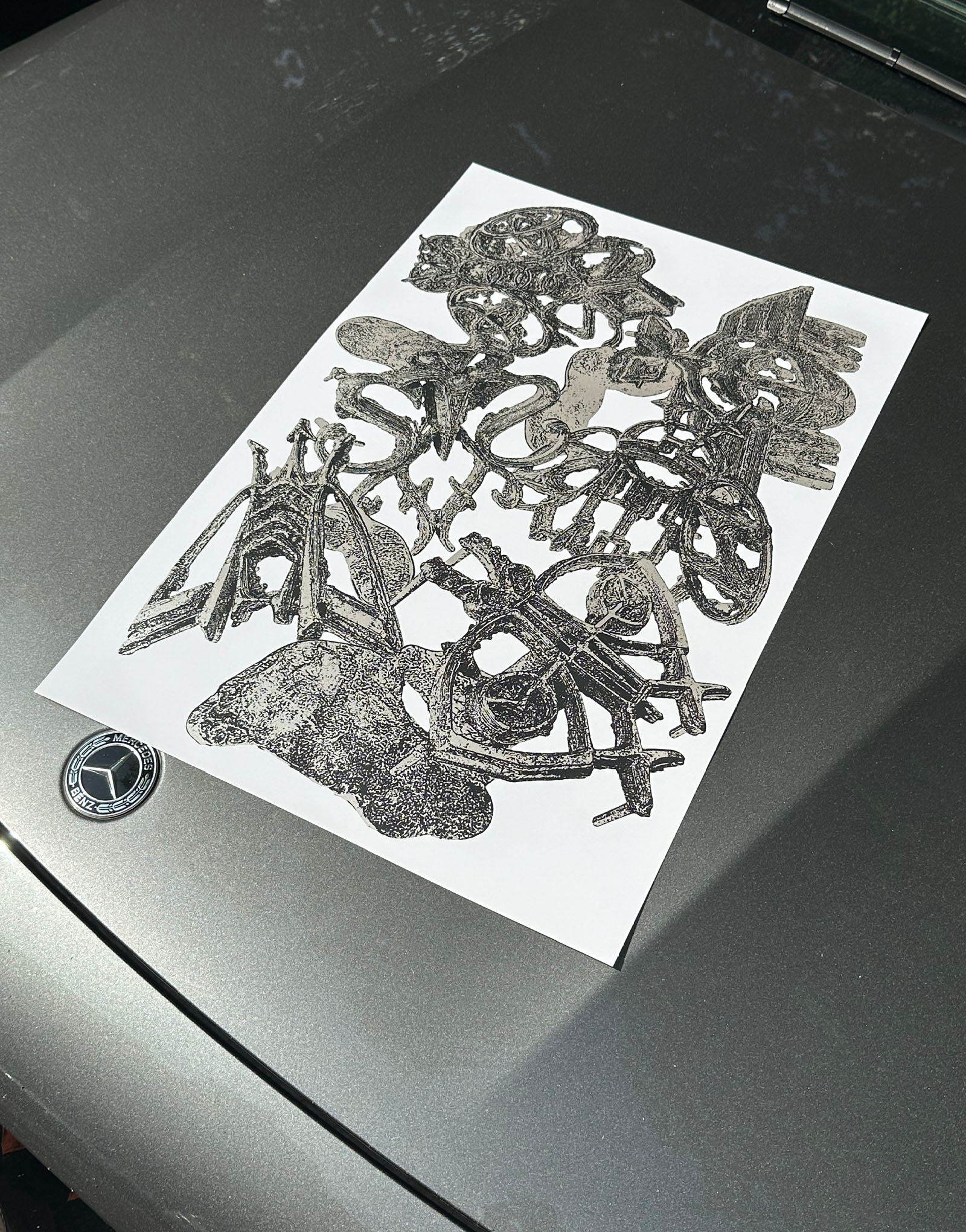
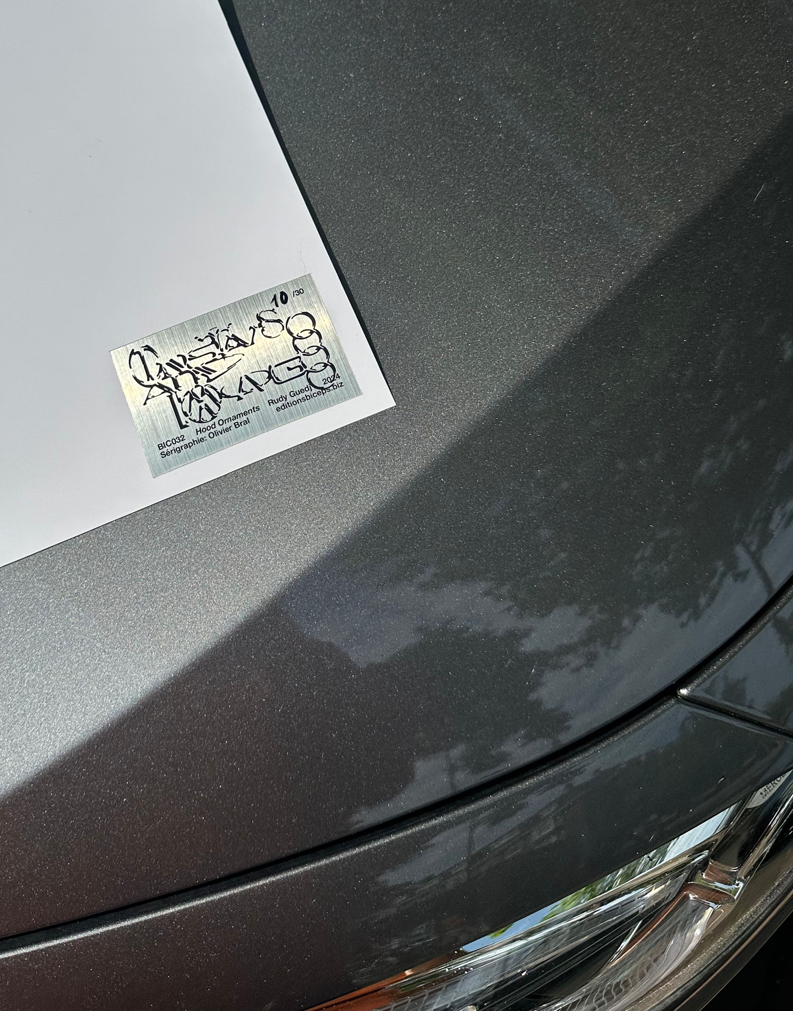
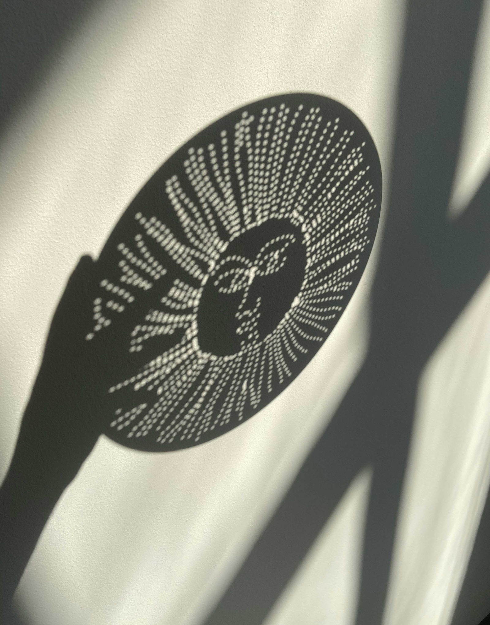
Instars and Imago, published by Biceps Editions.
Screenprinted edition of 30, 60×40cm
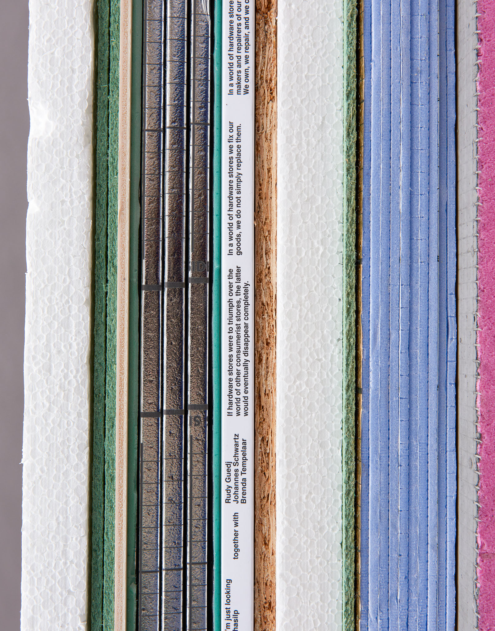

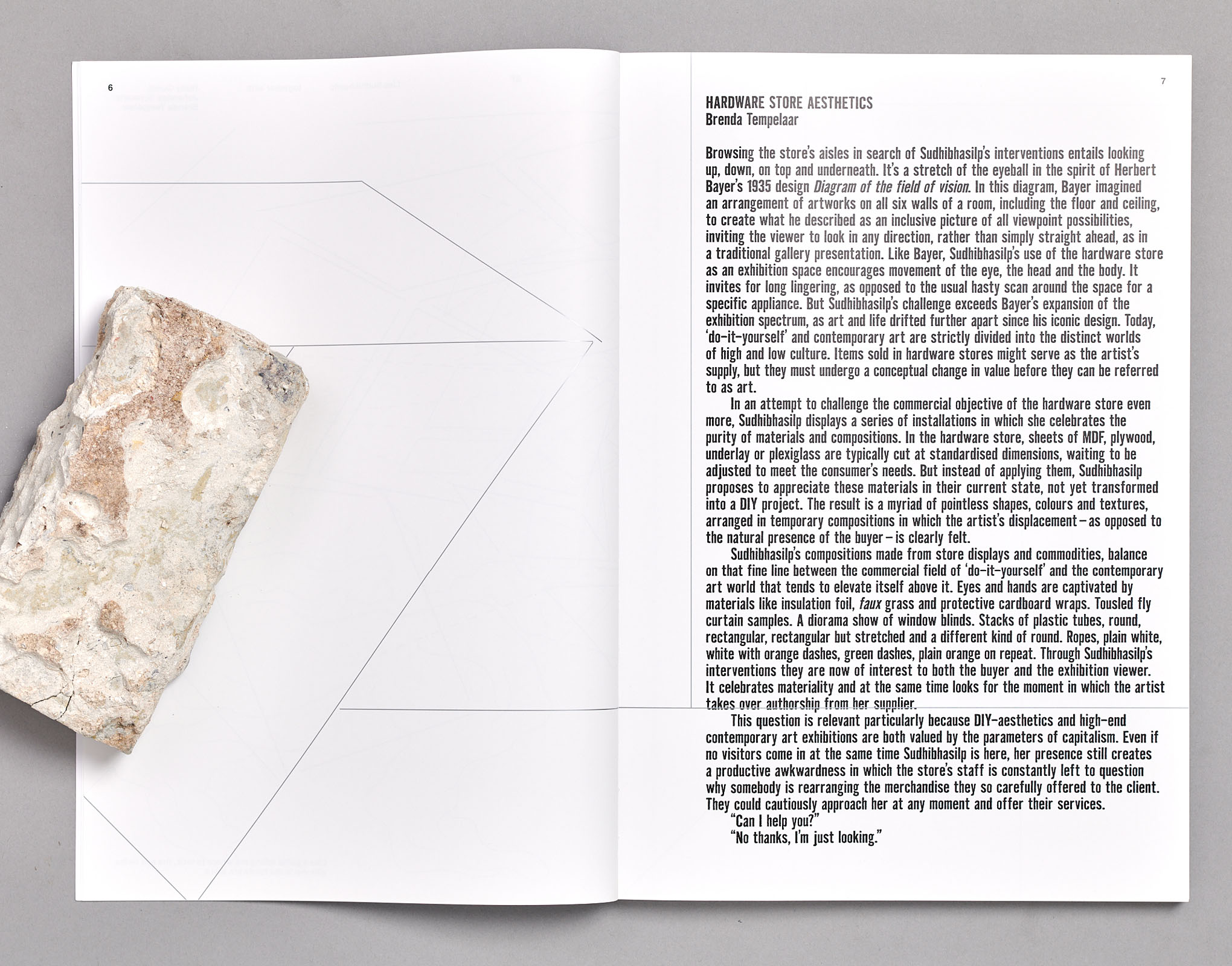
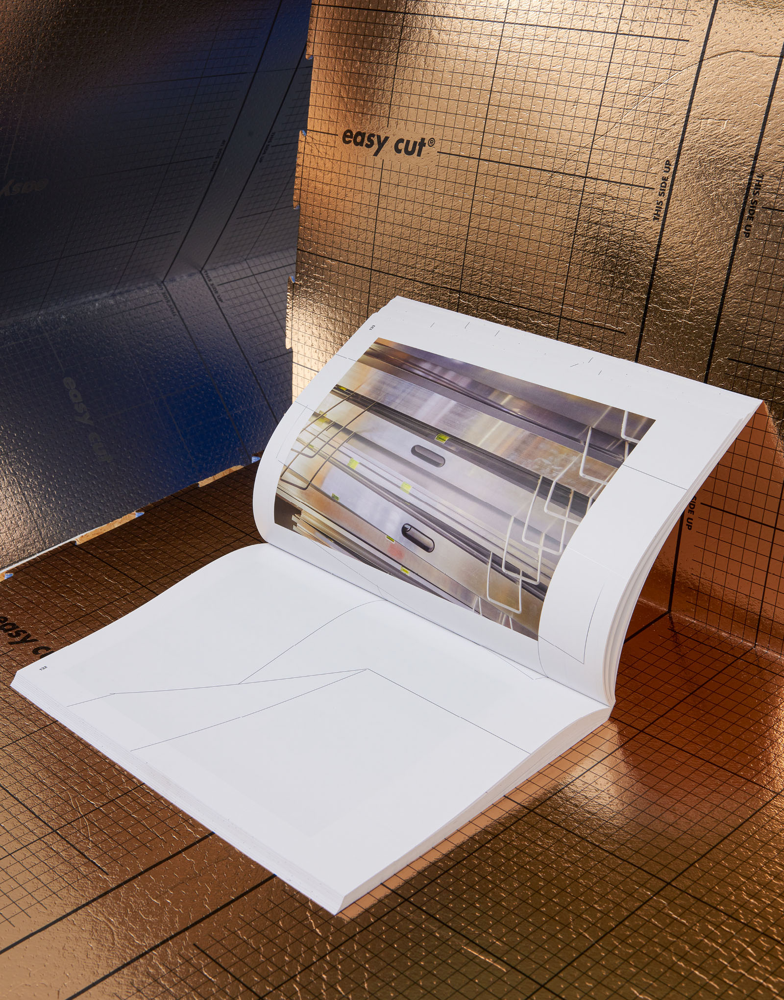
No thanks, I'm just looking, Lisa Sudhibhasilp, collab. Johannes Schwartz, published by Building Fictions
Publication design and publishing
208 pages, 230×340 mm
(Photos by Elmer Driessen)
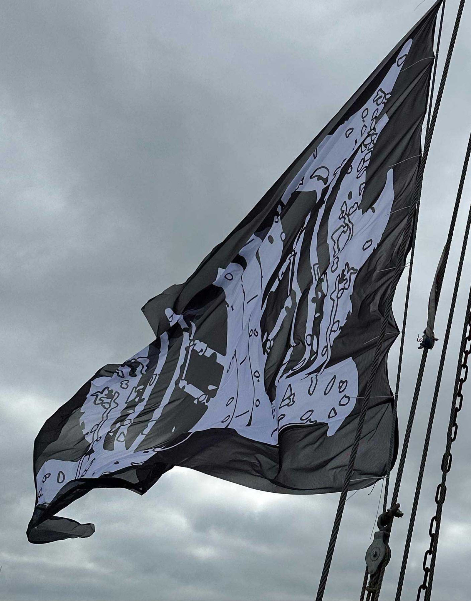
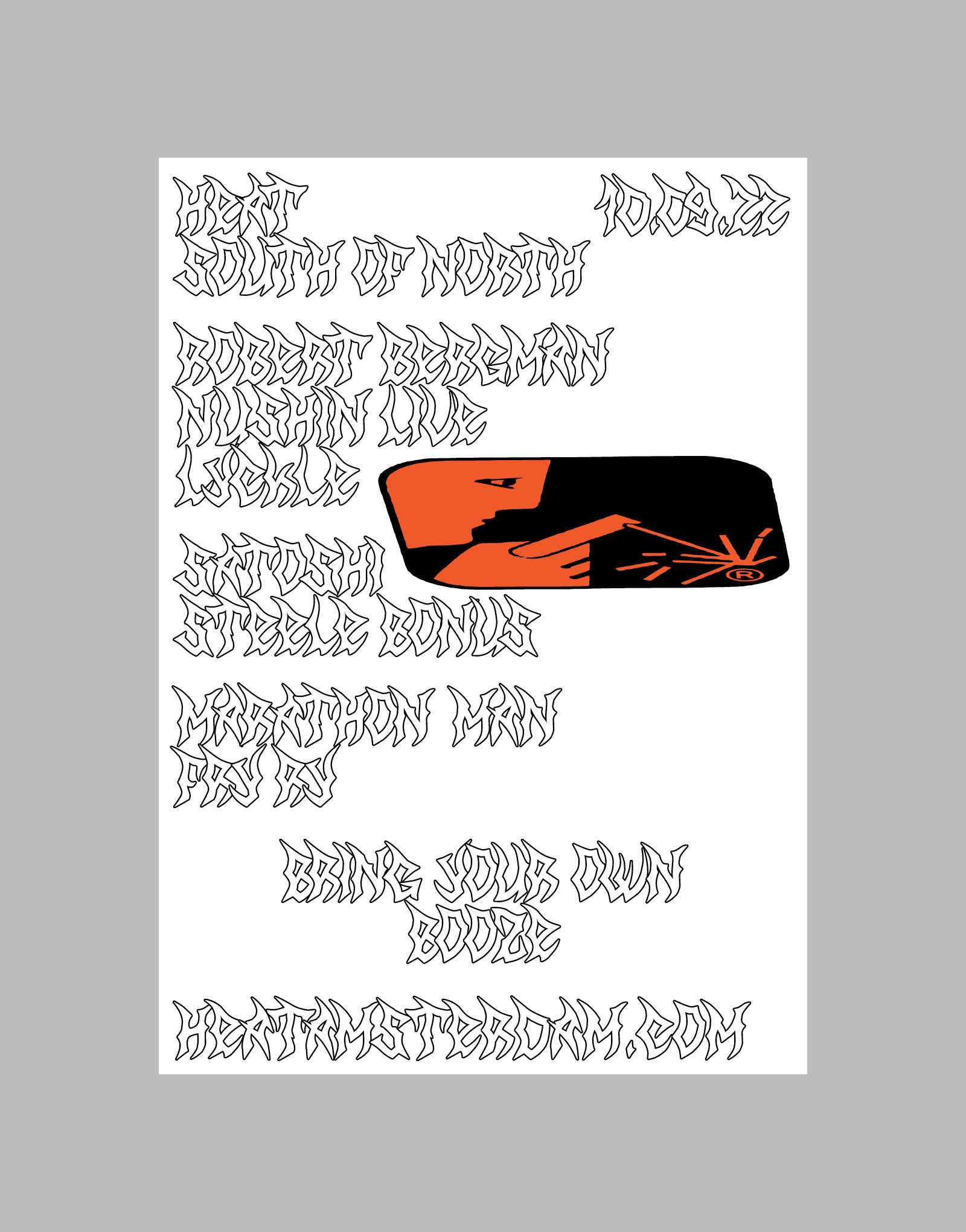
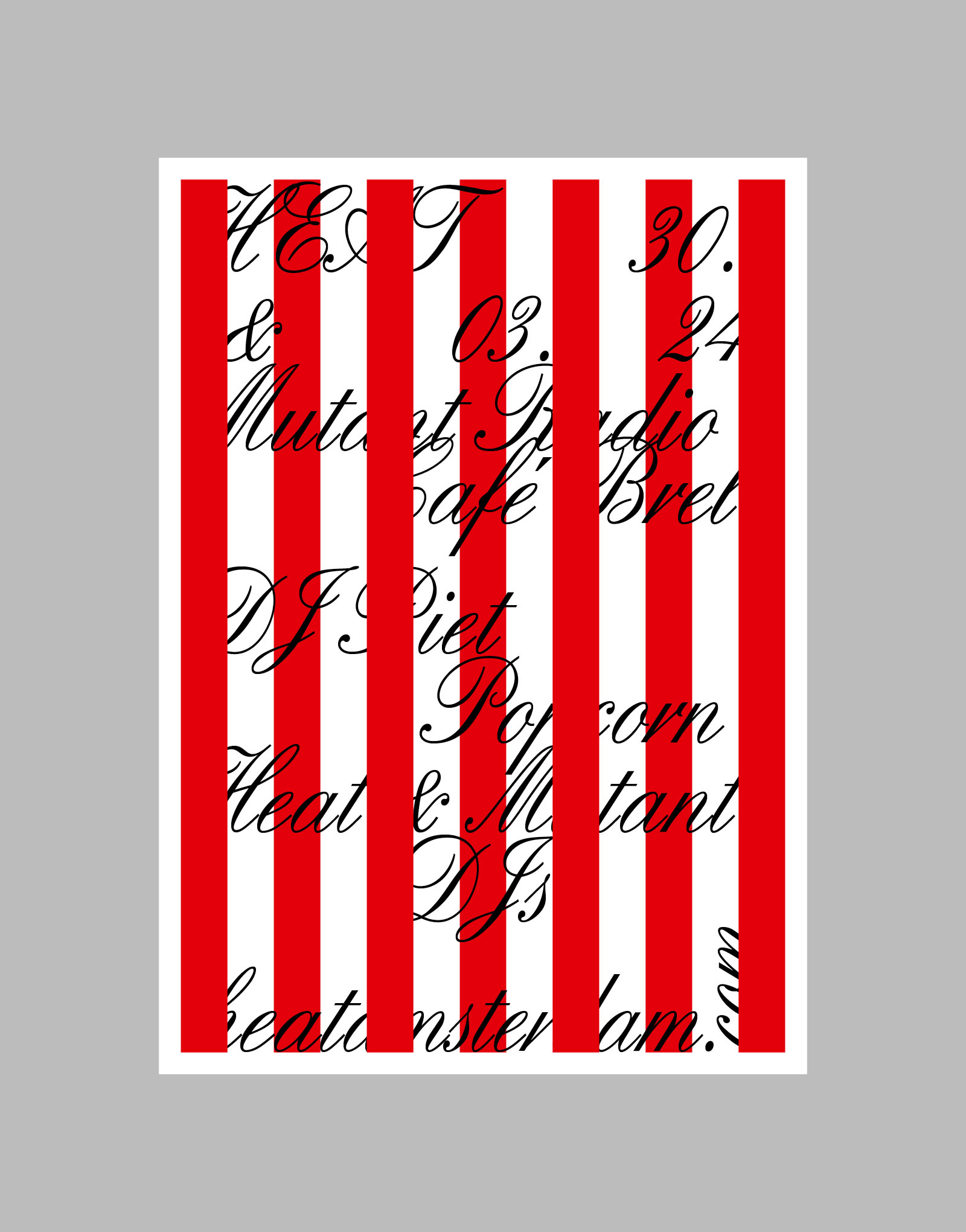
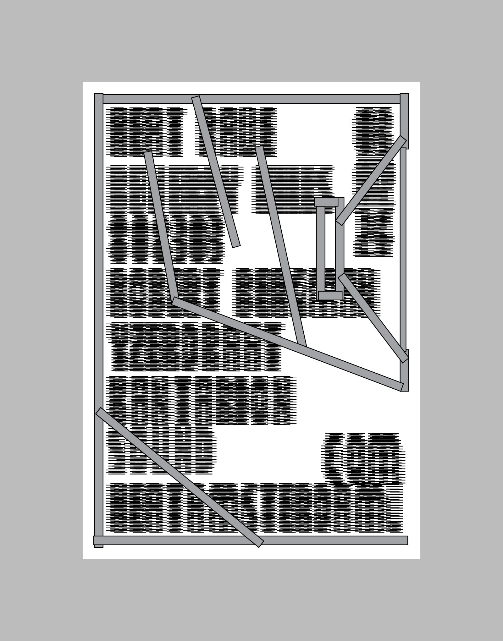
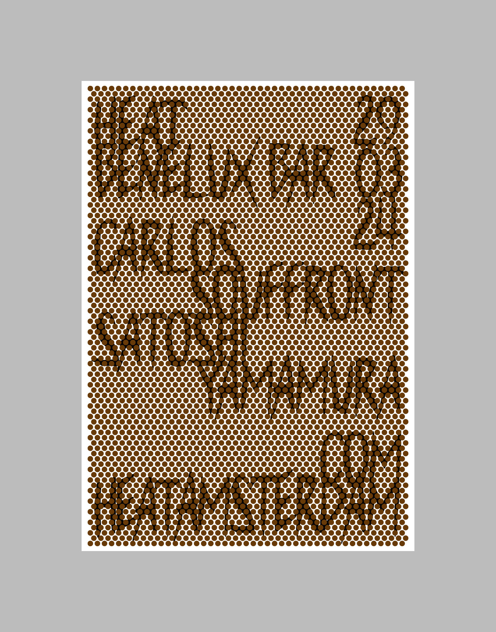
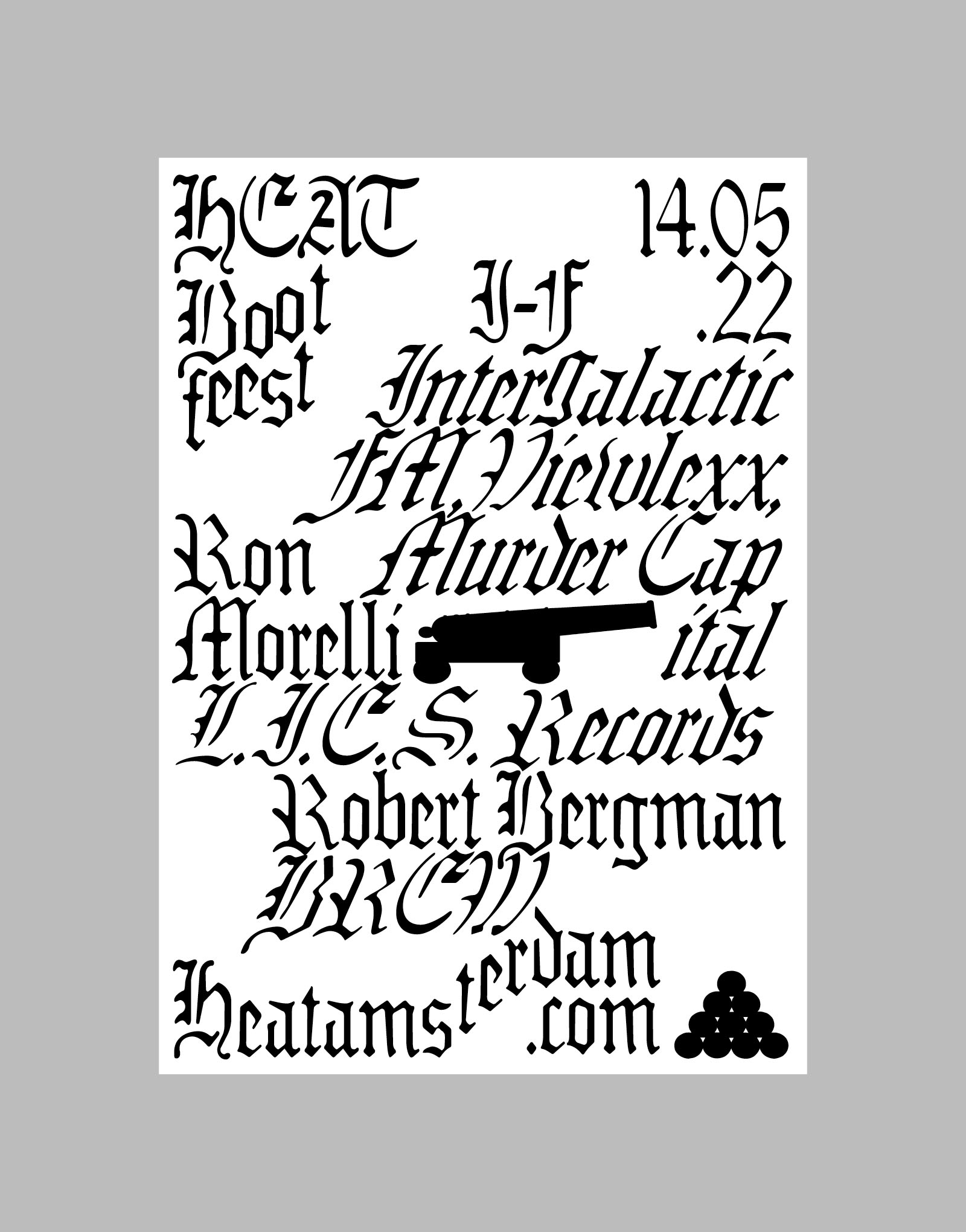
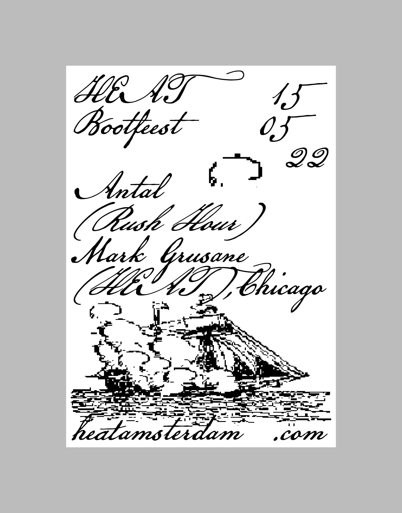
Ongoing art direction and design for HEAT Amsterdam, collab. Nora Steenbergen

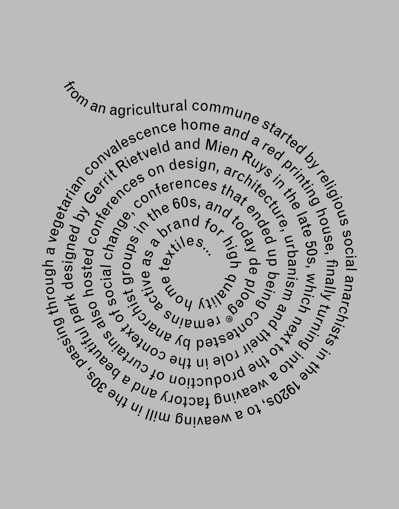
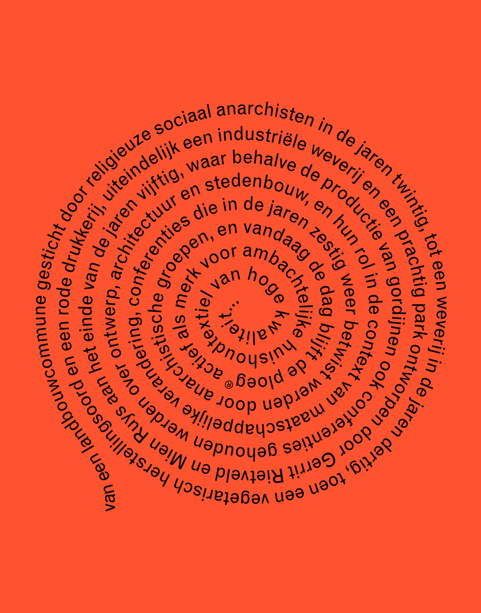
De Ploeg in Bergeijk, Nieuwe Instituut, 2018–2022
Exhibition design and identity, scenography
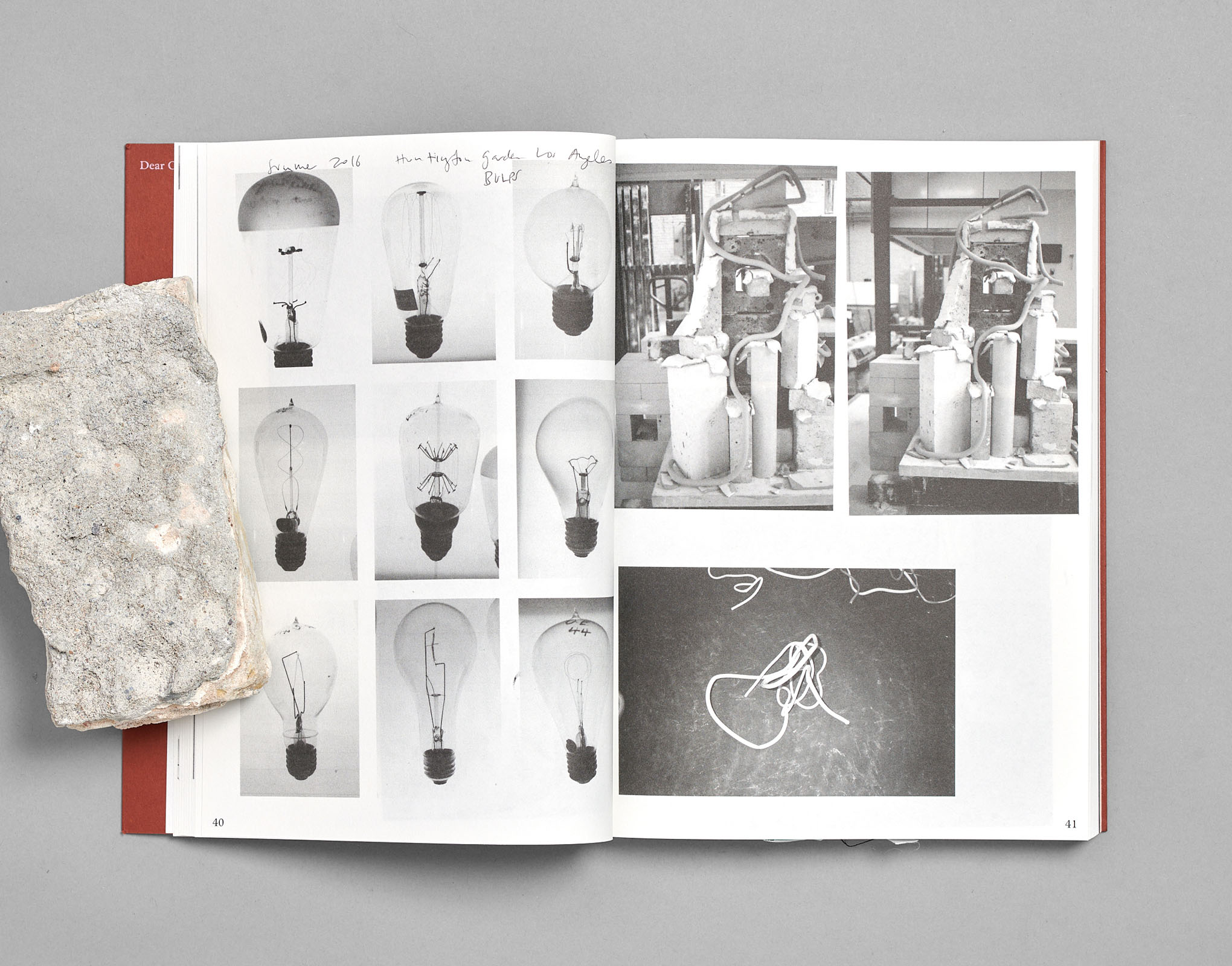
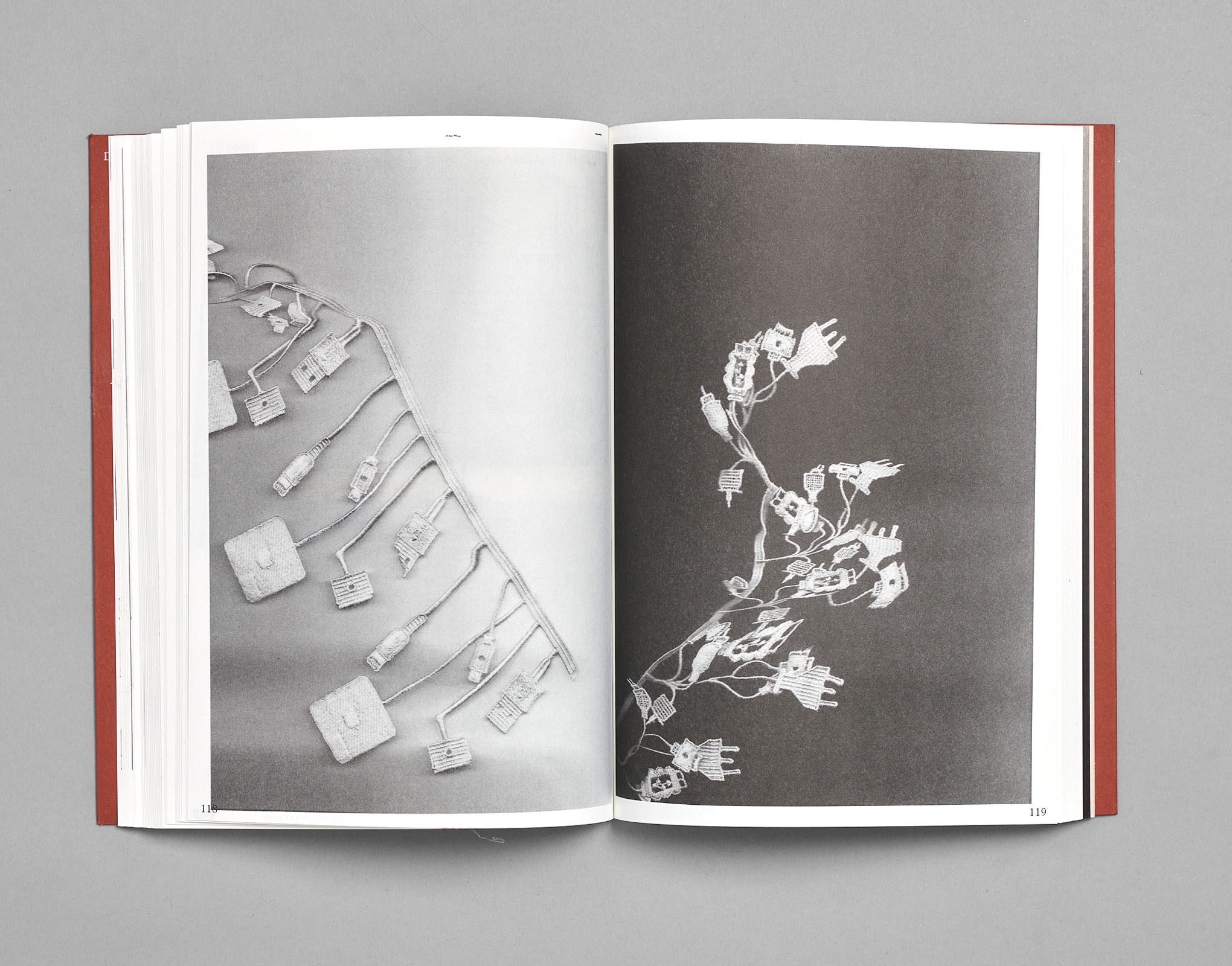
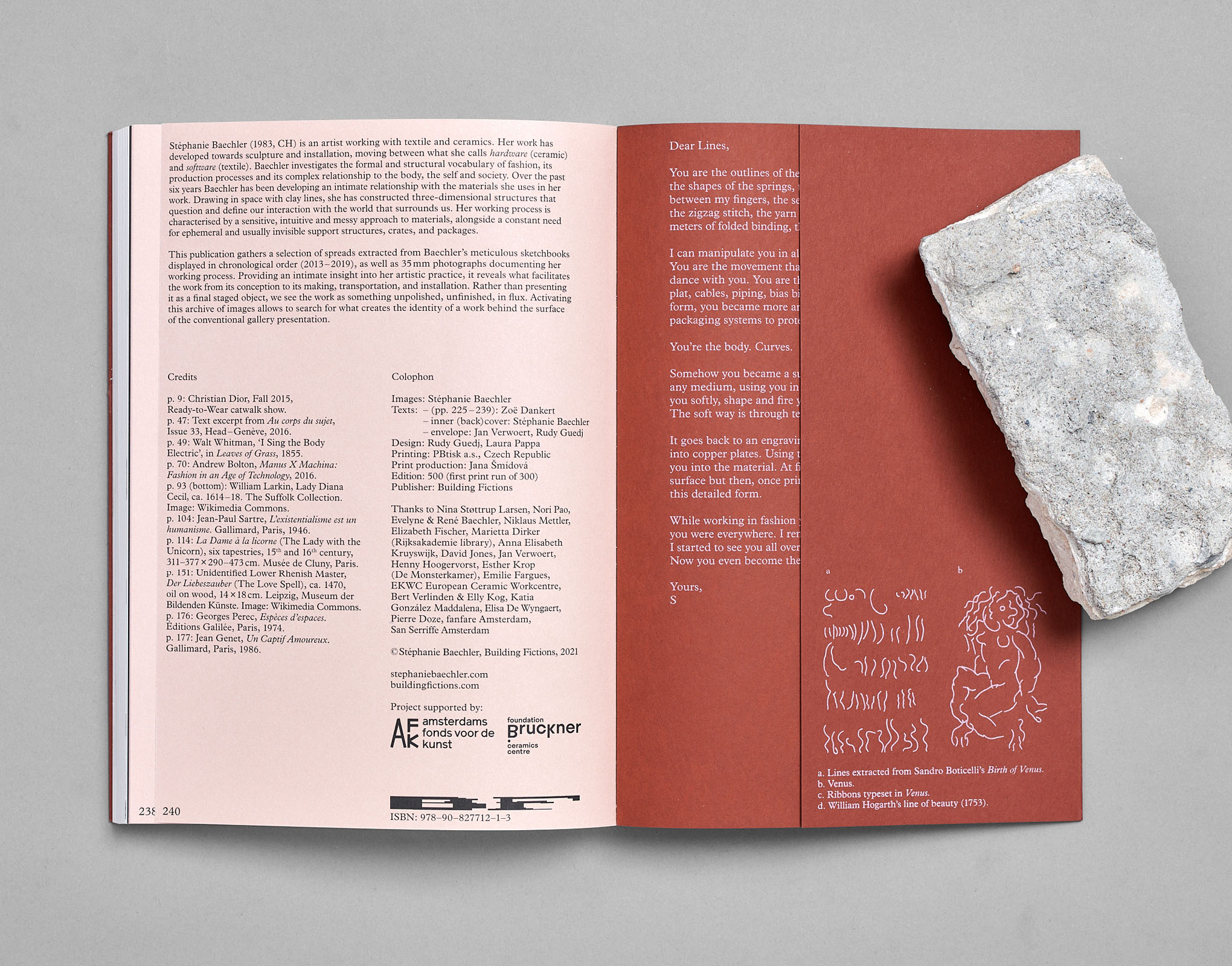
Dear Clay,, Stéphanie Baechler, published by Building Fictions
Publication design collab. Laura Pappa, publishing
240 pages, 200×280 mm
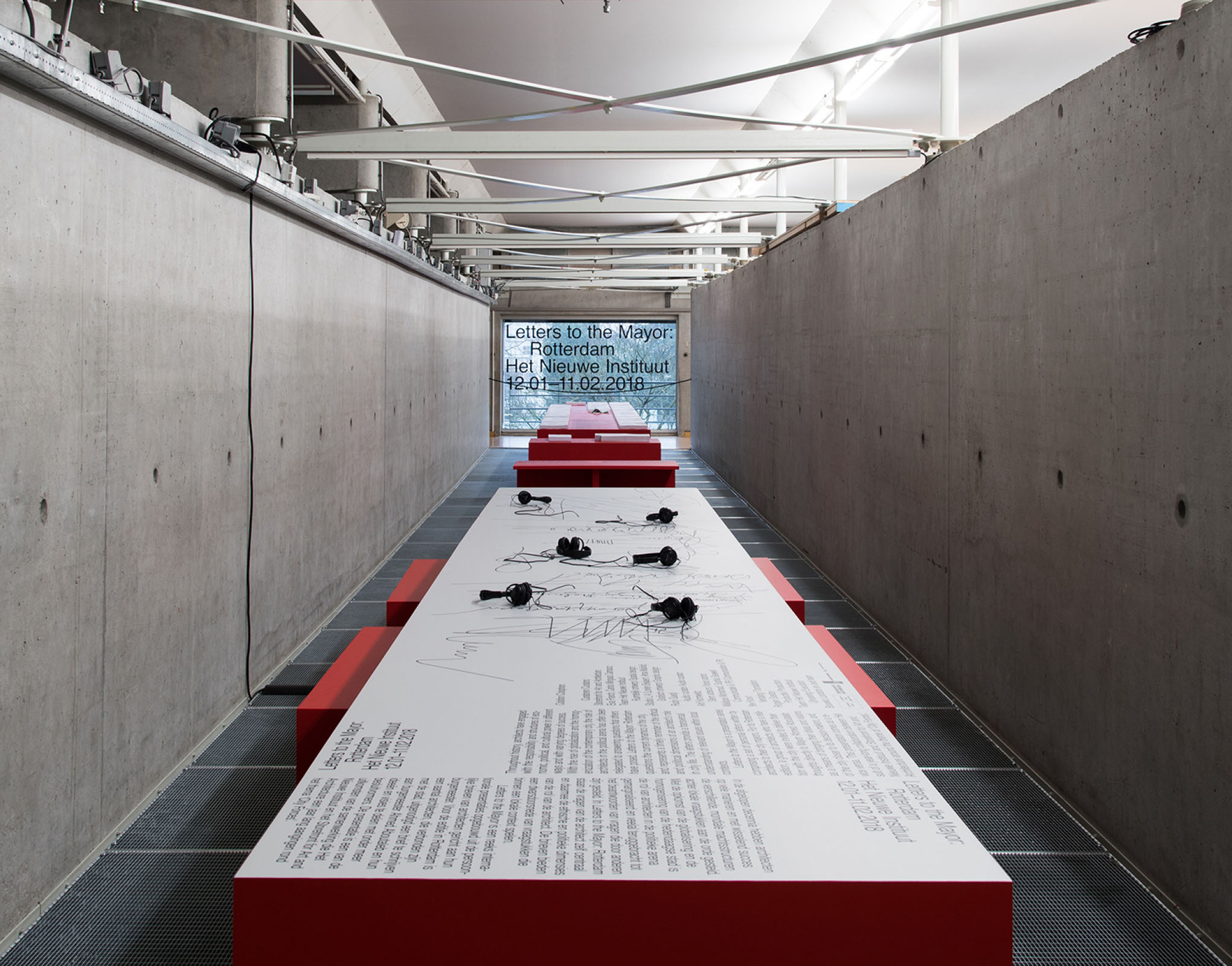
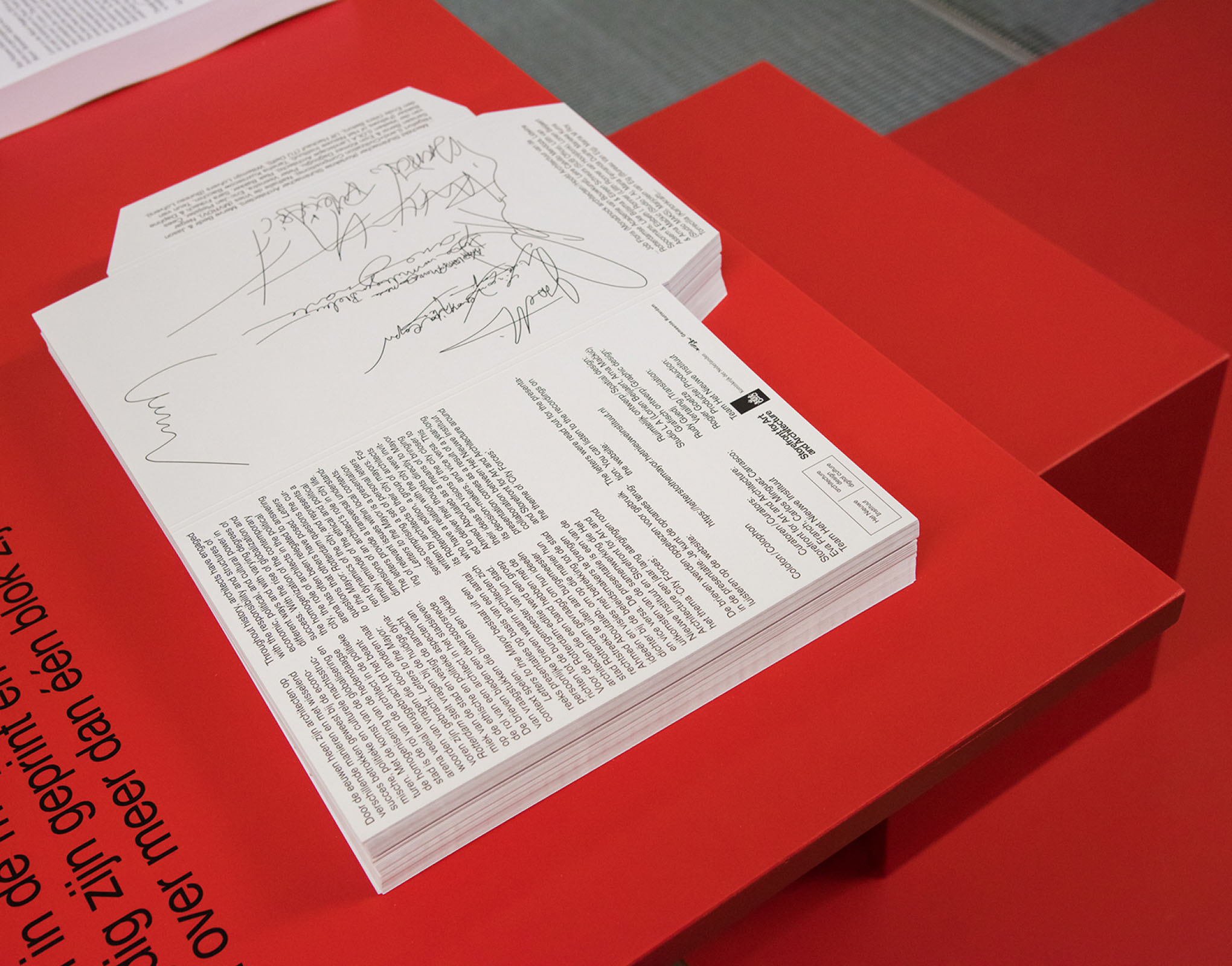
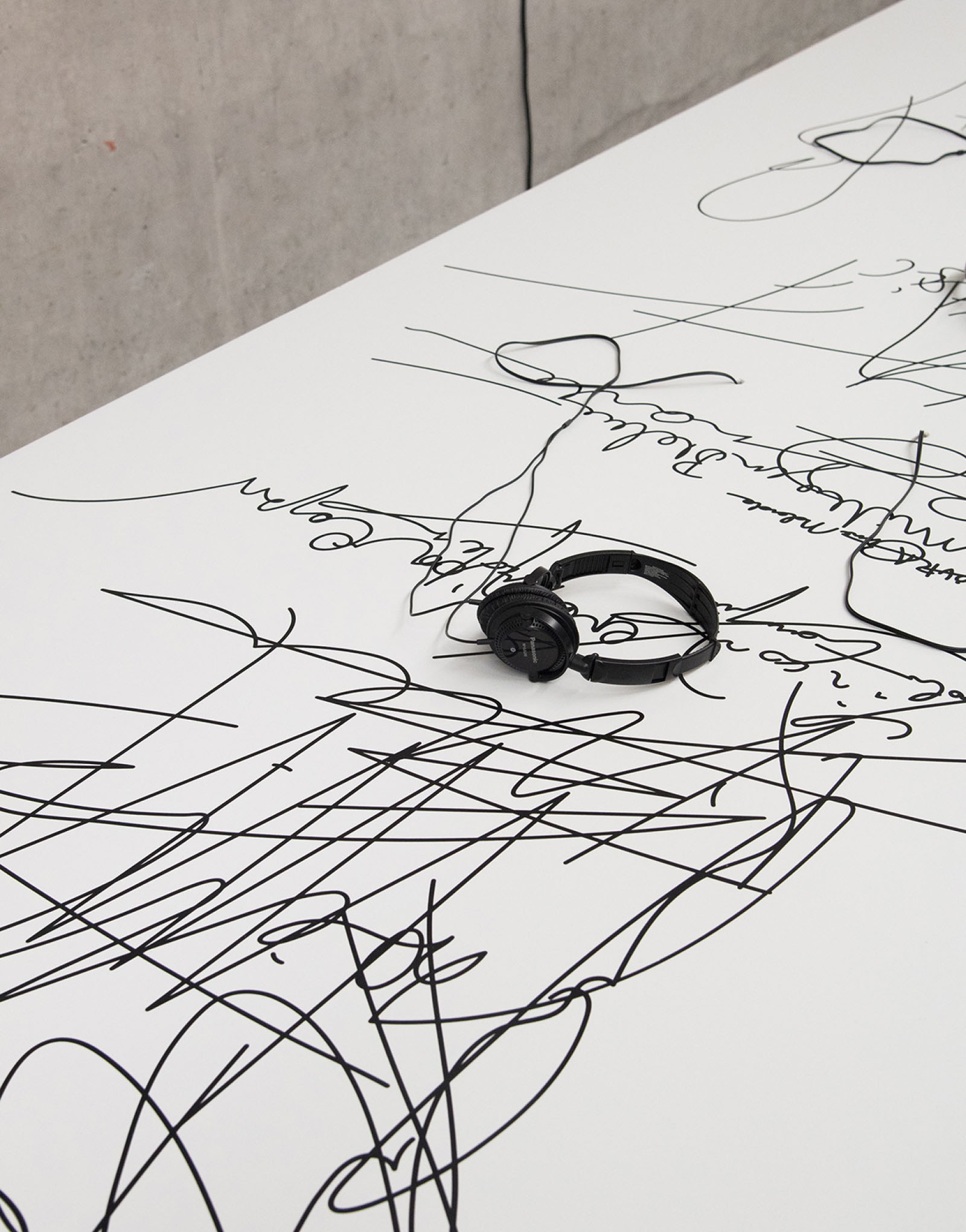
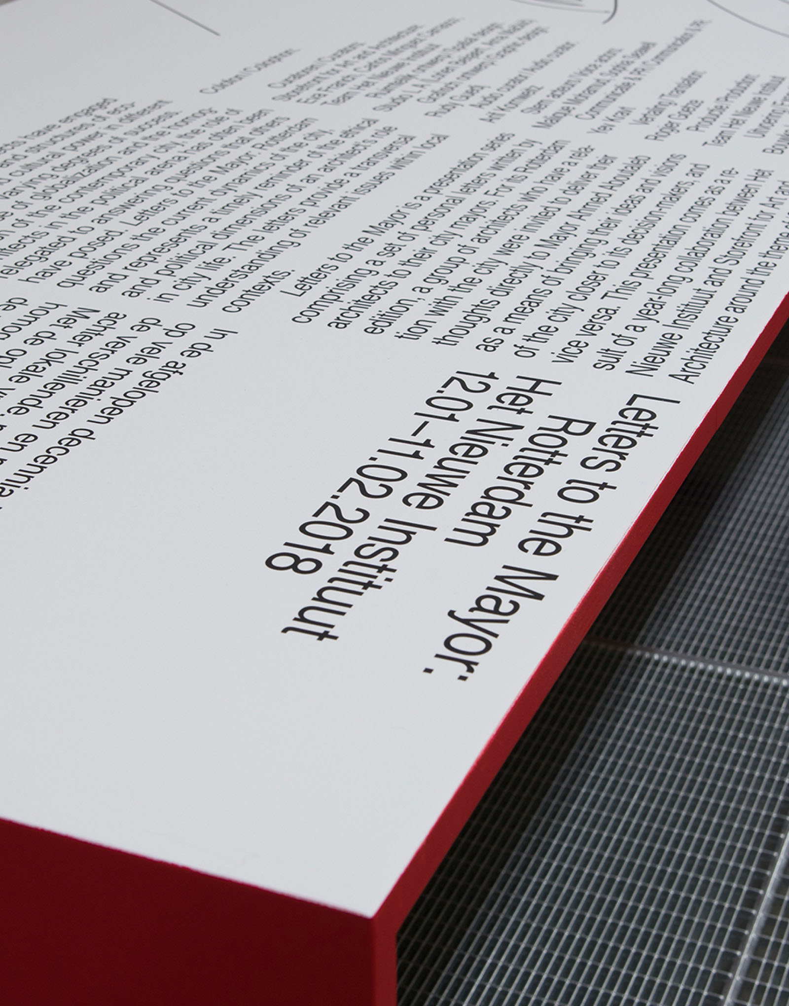
Letters to the Mayor, Rotterdam, Nieuwe Instituut
Exhibition design and identity

Cynara, Semis (FR), 2021
Drawing, writing